


Table of Contents
- Regional Cannabis Design Landscape
- West Coast Aesthetic: Innovation and Lifestyle Branding
- East Coast Design Approach: Sophistication and Heritage
- Midwest and Southern Markets: Emerging Regional Identities
- Bridging Regional Differences: Cross-Market Design Strategies
- Future Regional Design Evolution: Convergence and Divergence
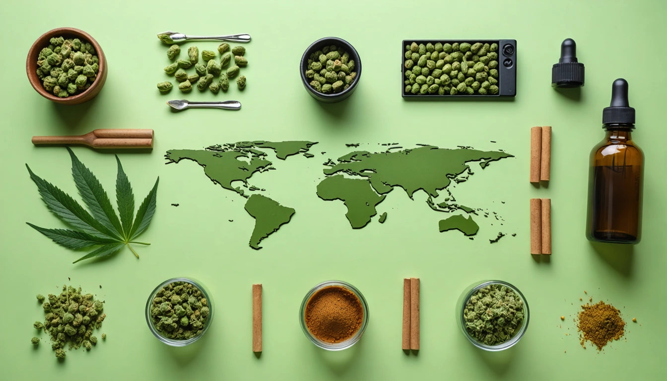
Cannabis packaging design varies significantly across different regions of the United States, reflecting local cultures, market maturity, and consumer preferences. Understanding these regional design preferences helps brands create packaging that resonates with specific geographic markets while maintaining brand consistency nationwide.
Regional Cannabis Design Landscape
The cannabis industry has developed distinct regional aesthetics that mirror the evolution of local markets. These design languages have emerged from a combination of regulatory frameworks, consumer demographics, and cultural influences unique to each area. According to research on regional design preferences, these visual differences can significantly impact consumer perception and purchasing decisions.
West Coast Aesthetic: Innovation and Lifestyle Branding
California Influence
West Coast cannabis packaging, particularly from California, often features bright colors, bold typography, and lifestyle-oriented imagery. The mature market has embraced a relaxed, often playful aesthetic that emphasizes the product's role in enhancing everyday experiences. Many brands utilize color psychology to evoke feelings of wellness, creativity, and natural vitality.
Pacific Northwest Variations
In contrast, the Pacific Northwest tends toward eco-conscious design elements, featuring recycled materials, earth tones, and minimalist layouts. This approach aligns with the region's environmental values and outdoor lifestyle. Brands often highlight sustainability credentials through their packaging choices, including resealable storage solutions that reduce waste while maintaining product freshness.
East Coast Design Approach: Sophistication and Heritage
Northeastern Aesthetics
East Coast markets, particularly in the Northeast, favor more restrained, sophisticated design elements. Packaging often features muted color palettes, classic typography, and premium finishes that communicate reliability and professionalism. This approach aligns with typography and font choices that resonate with urban professionals and medical cannabis patients.
Mid-Atlantic Distinctions
The Mid-Atlantic region blends elements of both coasts while emphasizing heritage and craftsmanship in design. Packaging often incorporates historical references, traditional production methods, and locally-inspired visual elements. These designs tend to focus on building trust through authenticity and educational content on labels.
Midwest and Southern Markets: Emerging Regional Identities
As newer legal markets develop in the Midwest and South, distinct regional preferences are emerging that blend traditional values with contemporary cannabis culture. These regions often favor:
- Straightforward, accessible designs that avoid industry stereotypes
- Educational elements that help new consumers navigate products
- Subtle branding that integrates discreetly into home environments
- References to local agricultural heritage and craftsmanship
These emerging markets present opportunities for brands to establish regional design languages that respect local sensibilities while still appearing contemporary and trustworthy.
Bridging Regional Differences: Cross-Market Design Strategies
Multi-state operators face the challenge of maintaining brand consistency while adapting to regional preferences. Successful approaches include developing flexible packaging style guides that allow for regional customization within a cohesive brand framework.
Some effective strategies include:
- Creating core packaging elements that remain consistent across regions
- Developing region-specific color variants or secondary graphics
- Adjusting messaging tone while maintaining key brand promises
- Using modular design systems that can be adapted to regional preferences
Future Regional Design Evolution: Convergence and Divergence
As the cannabis industry matures, we're witnessing both convergence and divergence in regional design trends. National brands are creating design systems flexible enough to resonate across regions, while local brands are doubling down on regional identity as a differentiator.
The interplay between minimalist and maximalist approaches varies by region, with coastal markets generally embracing cleaner designs while some interior markets favor more detailed, information-rich packaging.
Understanding these regional nuances allows brands to create packaging that feels authentic to local consumers while still maintaining scalability across markets. By respecting regional design preferences, cannabis companies can build stronger connections with consumers and enhance their products' appeal on dispensary shelves nationwide.


Leave a comment
All comments are moderated before being published.
This site is protected by hCaptcha and the hCaptcha Privacy Policy and Terms of Service apply.