


Table of Contents
- Understanding Color Systems in Printing
- What is Spot Color: Definition and Applications
- What is Process Color: CMYK Explained
- Key Differences Between Spot and Process Color
- When to Use Spot Color in Your Projects
- When Process Color Offers the Best Solution
- Hybrid Approaches: Combining Spot and Process Colors
- Practical Recommendations for Print Projects
Understanding Spot Color and Process Color: Key Differences and Best Practices
In the world of print design and production, understanding the difference between spot color and process color is crucial for achieving optimal results. Each system serves distinct purposes and offers unique advantages depending on your project requirements. This guide explores the fundamental distinctions between these color systems and provides practical advice on when to use each approach.
Understanding Color Systems in Printing
Color reproduction in printing relies on two primary methodologies: spot color and process color. These systems differ in how they create colors, their applications, and the results they deliver. The choice between spot vs process color can significantly impact the quality, consistency, and cost of your printed materials.
Before diving into specifics, it's worth noting that color theory fundamentals apply to both systems. As explored in our guide on understanding primary, secondary, and tertiary colors, the way we perceive and reproduce color follows consistent principles across different applications.
What is Spot Color: Definition and Applications
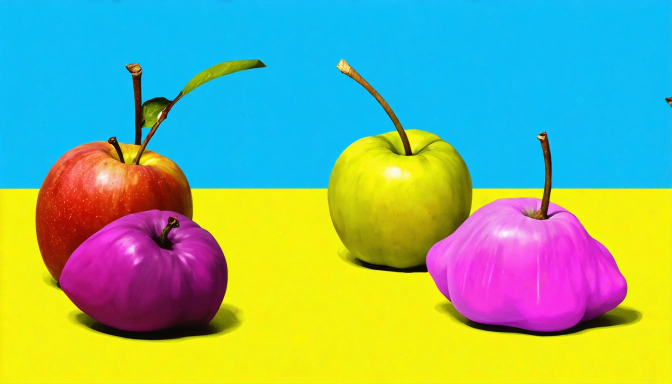
Spot color refers to pre-mixed, specific ink colors that are applied as separate ink layers during printing. Each spot color is a single, pure ink rather than a combination of other colors. The most common standardized spot color system is the Pantone Matching System (PMS), which provides exact formulations for thousands of colors.
Key Characteristics of Spot Colors:
- Pre-mixed inks with precise, consistent color formulations
- Applied as individual ink layers during printing
- Capable of producing colors outside the gamut of process printing
- Often used for brand colors requiring exact matching
- Can include specialty inks like metallics, fluorescents, and pastels
For brand consistency, spot colors are invaluable. As discussed in our article on understanding spot colors and visible identification marks, these colors ensure your brand elements remain consistent across all printed materials.
What is Process Color: CMYK Explained
Process color printing uses four standard ink colors—Cyan, Magenta, Yellow, and Key (black)—to create a full spectrum of colors. By printing tiny dots of these four colors in varying densities and patterns, process printing can reproduce photographic images and complex color gradients.
How Many Colors Are Used in Process Color?
Standard process color printing uses four colors (CMYK). These four inks combine in different proportions to create thousands of colors through a technique called halftoning, where dots of varying sizes create the illusion of continuous color tones.
In some high-end applications, extended gamut printing may use additional colors (such as orange, green, and violet) to achieve an even wider color range, but the standard process uses just the four CMYK colors.
Key Differences Between Spot and Process Color
Understanding process color vs spot color distinctions helps determine which approach best suits your project needs.
| Feature | Spot Color | Process Color |
|---|---|---|
| Number of Inks | Each color is a separate ink | Four standard inks (CMYK) |
| Color Accuracy | Highly precise, consistent | Can vary between print runs |
| Color Range | Limited by number of inks used | Thousands of colors possible |
| Best Applications | Logos, simple graphics, exact matching | Photos, gradients, complex images |
| Cost Factors | Higher for few colors, increases with each color | Cost-effective for full-color printing |
When maintaining product quality across different packaging materials, color consistency becomes crucial. For instance, when packaging products like our humidity control solutions for cannabis storage, consistent branding across different materials requires careful color management strategies.
When to Use Spot Color in Your Projects
Spot color printing offers significant advantages in specific scenarios:
- Brand Identity: When exact color matching is critical for logos and brand elements
- Limited Color Designs: For projects using only 1-3 colors
- Special Effects: When using metallic, fluorescent, or other specialty inks
- Fine Text and Lines: For sharper reproduction of small text and thin lines
- Color-Critical Applications: When color accuracy is more important than cost
Many packaging designs benefit from spot color printing, especially when brand recognition depends on consistent color reproduction across different materials and printing conditions.
When Process Color Offers the Best Solution
Process color printing provides the best process solutions in these scenarios:
- Photographic Images: For reproducing photographs and realistic images
- Complex Designs: When artwork contains many different colors or gradients
- Cost Efficiency: For full-color printing at larger quantities
- Variable Data: When each piece needs different information or images
- Digital Printing: Most digital presses use process color by default
For packaging designs featuring detailed product photography or complex color schemes, process printing typically offers the most practical approach. Understanding color relationships, as explored in our guide on color pairing with green and complementary shades, can help optimize process color designs.
Hybrid Approaches: Combining Spot and Process Colors
Many sophisticated print projects combine both spot and process colors to leverage the advantages of each system:
- Process Plus Spot: Using CMYK for images and adding spot colors for logos or specific elements
- Extended Gamut: Adding spot colors to expand the range of reproducible colors
- Special Effects: Using process colors for imagery and spot colors for varnishes or metallic effects
This hybrid approach is particularly valuable for premium packaging, where brand colors must be precisely matched while still incorporating complex imagery or design elements.
Practical Recommendations for Print Projects
When deciding between spot color vs process color for your next project, consider these practical guidelines:
- For projects with 1-3 colors that must match exactly, choose spot colors
- For full-color photography or designs with many colors, use process printing
- Consider your budget: spot colors add cost per color but may be cheaper for simple designs
- Discuss color gamut limitations with your printer before finalizing designs
- Request printed samples before committing to large production runs
- For critical brand colors, establish a tolerance range for acceptable variation
The decision between spot and process color ultimately depends on balancing your specific requirements for color accuracy, visual impact, and production costs. By understanding the strengths and limitations of each system, you can make informed choices that optimize both quality and efficiency in your print projects.


Leave a comment
All comments are moderated before being published.
This site is protected by hCaptcha and the hCaptcha Privacy Policy and Terms of Service apply.