


Table of Contents
How to Use Negative Space in Label Design
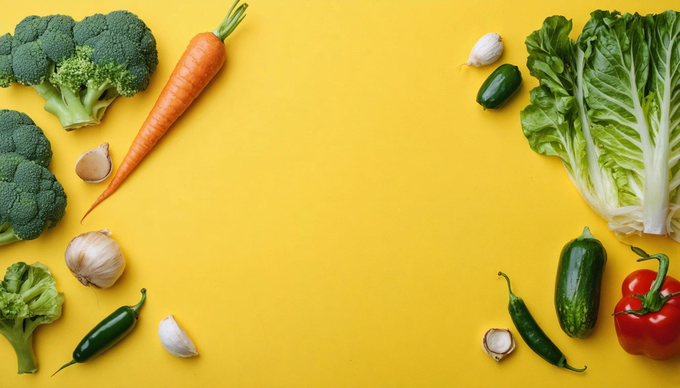
Negative space, also known as white space, is a powerful design element that can transform ordinary cannabis packaging into memorable brand experiences. By strategically incorporating emptiness around visual elements, designers create clarity, sophistication, and visual impact that helps products stand out on crowded dispensary shelves.
Understanding Negative Space in Label Design
Negative space refers to the empty areas between and around design elements on a label. Far from being wasted real estate, these spaces serve crucial functions in visual communication. Effective negative space creates breathing room that guides the eye, establishes hierarchy, and prevents visual fatigue.
In cannabis packaging, where compliance information competes with branding elements, thoughtful use of negative space becomes even more critical. Brands that master this balance create labels that communicate clearly while maintaining aesthetic appeal.
Strategic Benefits of Negative Space
Enhanced Brand Perception
Labels with appropriate negative space convey premium positioning. Research shows that consumers associate clean, spacious designs with higher quality products. This perception is particularly valuable in the cannabis market, where brands strive to distance themselves from stigmatized imagery.
Improved Information Hierarchy
Strategic white space creates natural pathways for the eye to follow, directing attention to key information. This helps consumers quickly identify essential details like strain type, potency, and usage instructions.
Implementation Techniques for Cannabis Labels
Implementing effective negative space requires intentional design decisions. Consider these practical approaches:
- Create margin buffers around critical information
- Use generous line spacing in compliance text
- Establish breathing room between distinct information sections
- Resist the urge to fill every available space
- Maintain consistent spacing patterns throughout the design
When designing labels for products like pre-rolls or concentrates, remember that specialized production equipment used in cannabis processing can influence packaging dimensions and constraints. Understanding these technical requirements helps designers create negative space that works within practical limitations.
Typography Integration with Negative Space
Typography and negative space work hand-in-hand to create readable, impactful designs. The impact of typography in packaging design is magnified when paired with thoughtful white space.
Consider these typography-specific negative space techniques:
- Increase letter spacing for headings to create an upscale feel
- Use adequate paragraph spacing to improve readability
- Create contrast between dense information areas and open spaces
- Allow key brand elements to stand alone with generous surrounding space
The relationship between font choice and negative space is explored further in this guide to packaging fonts that drive sales. The right combination can significantly impact consumer perception and purchasing decisions.
Practical Applications Across Product Categories
Flower Packaging
For flower labels, negative space can help highlight strain information and terpene profiles. Consider using white space to separate cannabinoid percentages from descriptive text, creating clear information zones.
Edibles and Concentrates
With these products, warning symbols and dosage information require prominence. Strategic negative space around these elements ensures they receive appropriate attention without compromising brand aesthetics.
Vape Products
Vape packaging often contains technical specifications alongside branding. Using negative space to create distinct information areas helps consumers quickly find relevant details about hardware, ingredients, and usage instructions.
As explained in this comprehensive guide to negative space in label design, the approach should vary based on product category and target audience expectations.
Design Evolution: Where Negative Space is Heading
The strategic use of negative space continues to evolve in cannabis packaging design. Forward-thinking brands are exploring several emerging approaches:
- Responsive negative space that adapts across packaging sizes
- Interactive white space that reveals additional information when viewed from different angles
- Negative space that forms subtle secondary imagery, creating discovery moments
- Minimalist designs that use extreme negative space to stand out in visually cluttered retail environments
These innovations demonstrate how negative space is becoming an increasingly sophisticated tool for brand differentiation. As studies on packaging perception continue to validate, thoughtful use of empty space can communicate brand values more effectively than additional graphic elements.
By mastering the strategic implementation of negative space, cannabis brands can create labels that not only meet regulatory requirements but also forge meaningful connections with consumers through clear, confident design that respects the viewer's visual experience.


Leave a comment
All comments are moderated before being published.
This site is protected by hCaptcha and the hCaptcha Privacy Policy and Terms of Service apply.