


Table of Contents
- Understanding Emerald Green and Aqua: Color Characteristics
- Complementary Colors for Emerald Green: Perfect Pairings
- Complementary Colors for Aqua: Stylish Combinations
- Color Theory Principles: Why These Combinations Work
- Practical Applications: Using Emerald Green and Aqua in Design
- Design Considerations for Vibrant Color Combinations
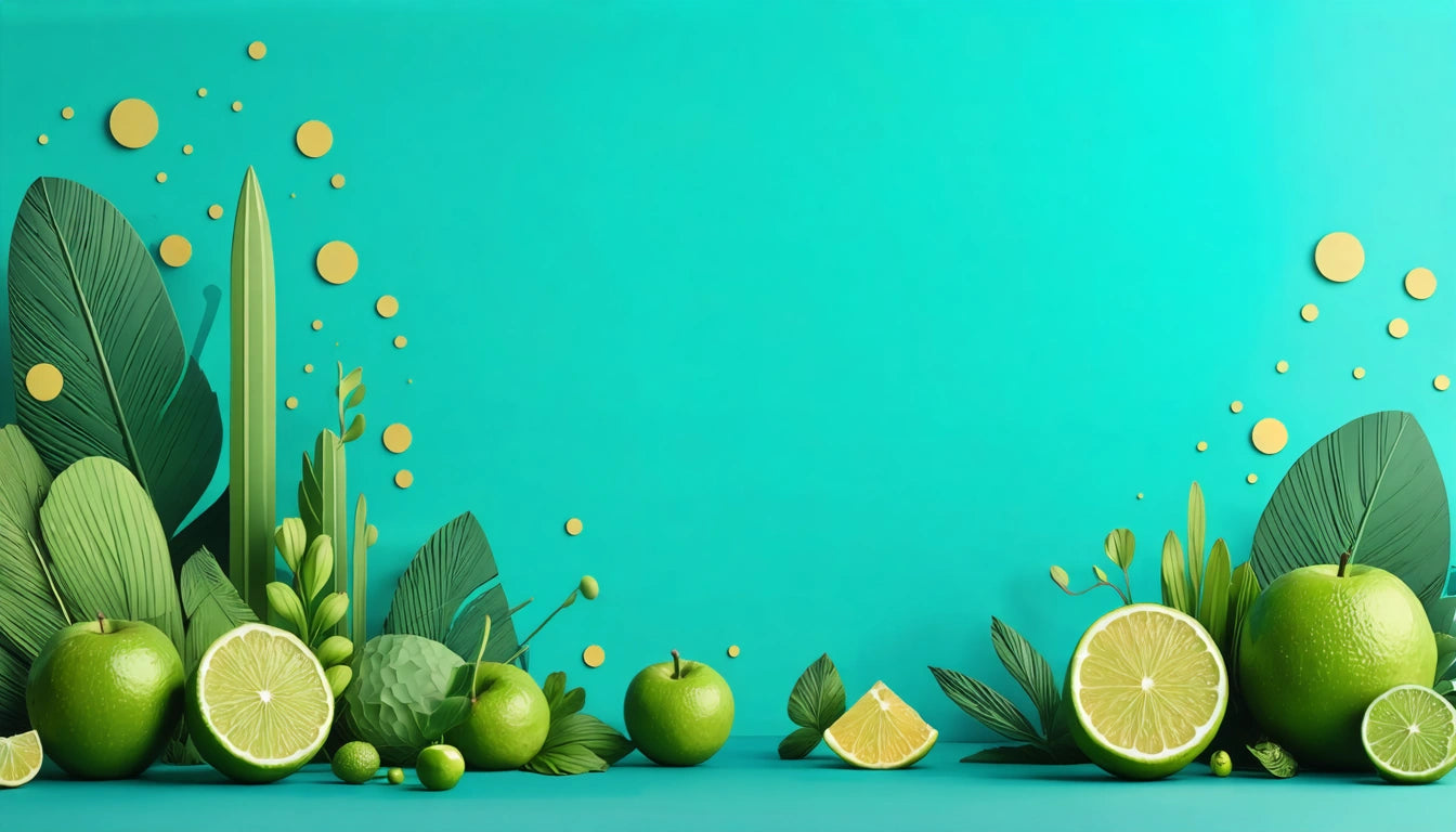
Complementary Colors for Emerald Green and Aqua: Stylish Pairing Ideas
Finding the perfect color combinations can transform any design project from ordinary to extraordinary. Emerald green and aqua are two versatile, vibrant colors that offer numerous pairing possibilities. Whether you're wondering what colors go well with emerald green or searching for the perfect complement to aqua, this guide explores stylish combinations and design principles to help you create visually stunning color palettes.
Understanding Emerald Green and Aqua: Color Characteristics
Before exploring complementary colors, it's essential to understand the unique characteristics of emerald green and aqua.
Emerald Green: Rich and Regal
Emerald green is a deep, vibrant green with a slight blue undertone. Named after the precious gemstone, this color exudes luxury, sophistication, and natural beauty. Its rich saturation makes it a bold choice that commands attention while still connecting to nature. Many designers wonder what color can I combine with emerald green to either enhance or balance its intensity.
Aqua: Fresh and Tranquil
Aqua is a medium blue-green shade that captures the essence of tropical waters. If you're wondering what does aqua color look like, imagine the refreshing blue-green of a clear lagoon. It's lighter and more playful than emerald green, offering a sense of tranquility and freshness. Finding what color goes well with aqua depends on whether you want to create contrast or harmony in your design.
Complementary Colors for Emerald Green: Perfect Pairings
When considering what colors go well with emerald green, several options create striking combinations:
- Coral and Peach: These warm tones create a beautiful contrast with emerald green's coolness. As explored in this guide on peach colors, the combination feels both sophisticated and fresh.
- Gold and Brass: Metallic tones enhance emerald green's luxurious quality, creating a rich, opulent palette.
- Cream and Ivory: For a more subdued look, these neutral tones soften emerald's intensity while maintaining its elegance.
- Ruby Red: This complementary pairing creates maximum contrast and visual impact.
- Deep Purple: Creates a regal, sophisticated palette that feels both elegant and mysterious.
Complementary Colors for Aqua: Stylish Combinations
For those wondering what color goes good with aqua, consider these harmonious pairings:
- Coral and Salmon: These warm pinks create a tropical, vibrant combination that feels fresh and energetic.
- Navy Blue: Creates depth and anchors aqua's lightness for a classic nautical palette.
- Crisp White: As detailed in this exploration of white, this pairing creates a clean, refreshing aesthetic perfect for modern designs.
- Soft Gray: Offers a sophisticated neutral base that allows aqua to shine.
- Tangerine Orange: Creates a high-energy complementary pairing that feels youthful and bold.
Color Theory Principles: Why These Combinations Work
Understanding basic color theory helps explain why certain combinations work well together. According to this resource on color theory, several principles guide effective color pairings:
Complementary Colors
Colors opposite each other on the color wheel create maximum contrast and visual interest. For emerald green, red-based colors create this complementary effect. For aqua, coral and salmon tones provide complementary contrast.
Analogous Colors
Colors adjacent on the color wheel create harmonious, cohesive palettes. Emerald green pairs beautifully with teals and blues, while aqua works well with light blues and seafoam greens.
Triadic Color Schemes
Colors evenly spaced around the color wheel create balanced, vibrant combinations. For emerald green, purple and orange create a triadic scheme. For aqua, soft violet and coral create a pleasing triadic palette.
Practical Applications: Using Emerald Green and Aqua in Design
Both emerald green and aqua have practical applications across various design contexts:
Interior Design
Emerald green makes a statement as an accent wall or in luxurious textiles like velvet. Aqua creates a refreshing atmosphere in bathrooms and coastal-themed spaces. Both colors can be incorporated through accessories for a less permanent commitment.
Packaging Design
Color choices in packaging significantly impact consumer perception and product safety. For instance, safety guidelines for packaging design often influence color selections to ensure clear communication of product contents while maintaining visual appeal.
Fashion
Emerald green makes a luxurious statement in evening wear and accessories. Aqua brings a refreshing pop to spring and summer wardrobes. Both colors can be paired with neutrals for everyday wear or complementary colors for bold statements.
Digital Design
Emerald green conveys growth, prosperity, and reliability in digital interfaces. Aqua creates a sense of tranquility and cleanliness. Both colors should be used strategically to guide user attention and convey brand values.
Design Considerations for Vibrant Color Combinations
When working with vibrant colors like emerald green and aqua, keep these design principles in mind:
Balance Through Neutrals
Incorporate neutral tones like white, cream, or gray to prevent overwhelming the eye. As highlighted in this guide to green color pairings, neutrals provide visual rest while allowing vibrant colors to shine.
Consider Lighting Conditions
Both emerald green and aqua can appear dramatically different under various lighting conditions. Natural daylight reveals their true tones, while artificial lighting may enhance or diminish their vibrancy.
Apply the 60-30-10 Rule
For balanced designs, consider using your dominant color (like a neutral) for 60% of the space, your secondary color (emerald green or aqua) for 30%, and an accent color for the remaining 10%.
Test Before Committing
Always test color combinations in small applications before making major investments. This is particularly important with saturated colors like emerald green that can feel overwhelming in large applications.
By understanding the characteristics of emerald green and aqua and applying color theory principles, you can create harmonious, visually striking designs that make the most of these beautiful colors. Whether used together or with their complementary partners, these versatile hues offer endless creative possibilities for any design project.


Leave a comment
All comments are moderated before being published.
This site is protected by hCaptcha and the hCaptcha Privacy Policy and Terms of Service apply.