


Table of Contents
- Retail Lighting Challenges for Cannabis Packaging
- Color and Contrast Techniques for Maximum Visibility
- Structural Design Considerations for Shelf Impact
- Typography and Readability Under Different Lighting
- Visual Hierarchy Strategies for Quick Recognition
- Evolving Your Shelf Presence: Adaptive Design Strategies
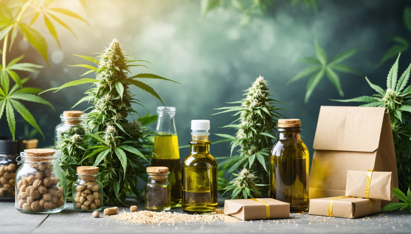
In the competitive cannabis retail environment, packaging that stands out under various lighting conditions can significantly impact consumer selection and brand recognition. Dispensary lighting varies widely, from bright LED displays to moody, atmospheric settings, creating unique challenges for packaging designers seeking maximum shelf visibility.
Retail Lighting Challenges for Cannabis Packaging
Cannabis retail environments present distinct lighting scenarios that directly affect how products are perceived. Common lighting challenges include:
- Spotlighting that creates harsh shadows or glare on packaging
- Ambient lighting that may wash out certain colors
- Display case lighting that can alter color perception
- Backlighting that affects transparency and opacity
Understanding these variables is essential when designing packaging that maintains visual impact regardless of display conditions. Effective designs account for how color psychology in cannabis packaging interacts with different lighting scenarios.
Color and Contrast Techniques for Maximum Visibility
Strategic use of color and contrast creates packaging that remains visible under various lighting conditions. High-contrast color combinations maintain legibility even in dimmer settings, while metallic and reflective elements can capture and amplify available light.
Color Selection Strategies
When selecting colors for optimal shelf visibility, consider:
- Using complementary colors for maximum contrast
- Incorporating fluorescent or neon accents for attention-grabbing highlights
- Implementing color blocking to create distinct visual sections
- Testing colors under multiple lighting conditions before finalizing designs
The regional context also matters, as noted in regional design preferences research, with West Coast markets often favoring brighter, more saturated colors compared to East Coast preferences for sophisticated, subdued palettes.
Structural Design Considerations for Shelf Impact
The physical structure of packaging significantly influences shelf visibility. Unique shapes create distinctive silhouettes that stand out among competitors. Our safety-compliant container options can be selected strategically to maximize shelf presence while maintaining required child-resistant functionality.
Dimensional Techniques
Consider these structural approaches to enhance visibility:
- Varied heights and widths to break monotonous shelf patterns
- Strategic use of depth to create shadow and dimension
- Custom shapes that create recognizable profiles
- Textural elements that catch both light and attention
The psychology behind different container shapes influences consumer perception, as explored in this analysis of packaging shapes. Tubes suggest precision, pouches convey freshness, while boxes communicate premium quality.
Typography and Readability Under Different Lighting
Typography plays a crucial role in shelf visibility, particularly for conveying essential product information under varied lighting. Font selection must balance brand personality with practical readability considerations.
Key typography strategies include:
- Using adequate contrast between text and background colors
- Selecting fonts with appropriate weight for visibility at distance
- Implementing hierarchy through size variation to guide the eye
- Avoiding overly decorative fonts for essential information
For deeper insights into effective typography choices, this guide on typography for cannabis consumers offers valuable guidance on fonts that both resonate with target audiences and maintain legibility under retail conditions.
Visual Hierarchy Strategies for Quick Recognition
Effective visual hierarchy ensures consumers can quickly identify key information about your product, even in suboptimal lighting conditions. This becomes particularly important when balancing creative design elements with regulatory compliance requirements.
Creating Clear Visual Pathways
Implement these techniques to guide consumer attention:
- Position your brand name and logo in the upper portion for immediate recognition
- Use size variation to emphasize the most important elements
- Create white space around key information to improve visibility
- Apply consistent patterns across product lines for brand recognition
Finding this balance between creativity and compliance is explored further in this article on compliance and creativity in cannabis packaging layouts.
Finish and Material Considerations
Surface treatments significantly impact how packaging interacts with retail lighting:
- Matte finishes reduce glare but may appear dull under dim lighting
- Gloss finishes create visual pop but can produce unwanted reflections
- Soft-touch coatings add tactile appeal while diffusing light
- Selective spot UV or foil accents draw attention to specific elements
The strategic use of these finishes can dramatically enhance shelf presence, as detailed in this examination of texture and finish effects in cannabis packaging.
Evolving Your Shelf Presence: Adaptive Design Strategies
As cannabis retail environments continue to evolve, packaging design must adapt to maintain optimal visibility. Forward-thinking brands are implementing flexible design systems that can be adjusted for different retail environments without losing brand consistency.
Consider these approaches for future-proof packaging visibility:
- Developing packaging variations optimized for different retail settings
- Creating modular design systems that maintain brand identity while allowing for adaptation
- Incorporating subtle interactive elements that engage consumers regardless of lighting
- Building relationships with retailers to understand upcoming display environment changes
The ability to create packaging that performs well across various retail environments while maintaining a consistent brand identity represents the next frontier in cannabis packaging design. As the industry matures, brands that master this balance between adaptability and consistency will achieve the greatest shelf visibility and consumer recognition.


Leave a comment
All comments are moderated before being published.
This site is protected by hCaptcha and the hCaptcha Privacy Policy and Terms of Service apply.