


How Cap Colors Influence Brand Perception with Chubby Gorilla Bottles
In the competitive cannabis and CBD marketplace, packaging details can significantly impact consumer perception and purchasing decisions. Among these details, cap colors on Chubby Gorilla bottles play a crucial role in brand identity, product recognition, and market positioning. This guide explores how strategic color choices influence consumer psychology and brand perception.
Psychology of Color in Packaging
Color psychology fundamentally shapes how consumers perceive products before they even handle them. Research consistently shows that color influences up to 85% of purchasing decisions, making it one of the most powerful nonverbal communication tools available to brands.
Emotional Responses to Colors
Different cap colors trigger specific emotional and psychological responses:
- Black caps: Convey premium quality, sophistication, and luxury
- White caps: Suggest purity, cleanliness, and simplicity
- Blue caps: Evoke trust, reliability, and calmness
- Green caps: Represent natural ingredients, wellness, and sustainability
- Red caps: Create urgency, excitement, and energy
- Purple caps: Indicate creativity, wisdom, and premium positioning
When selecting colors for Chubby Gorilla bottles, brands should consider both their target audience's preferences and the product's intended effects or benefits.
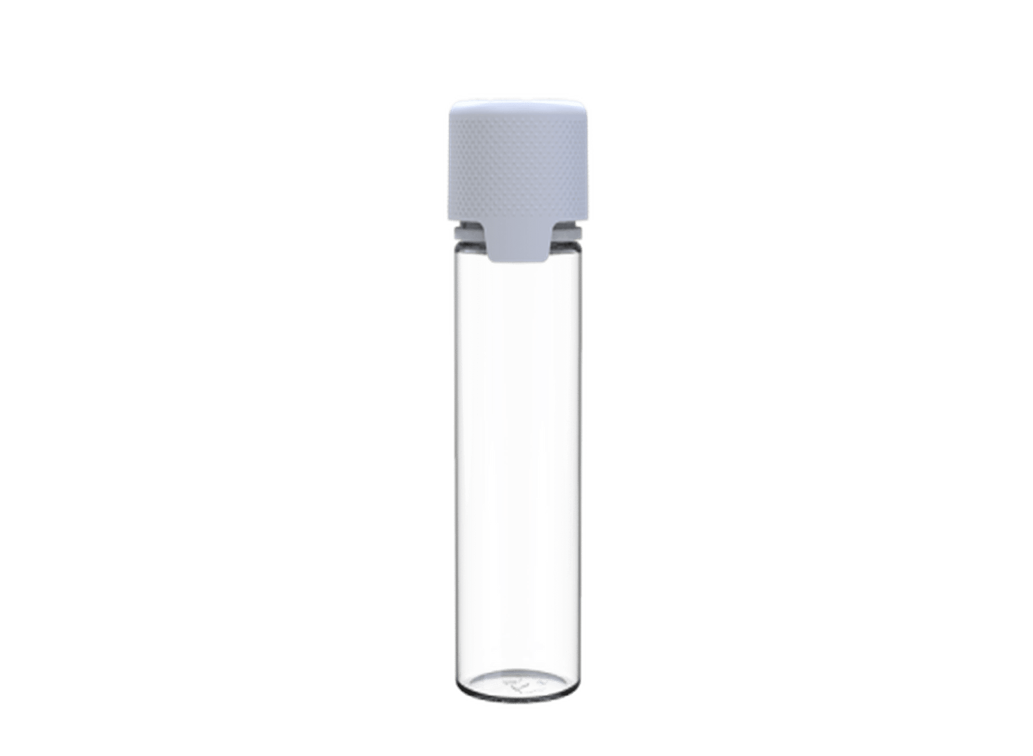
Chubby Gorilla Cap Color Options
Chubby Gorilla offers a diverse range of cap color options that allow brands to customize their packaging while maintaining the integrity of their child-resistant features. Their innovative designs, like the SmartCap, come in various colors while preserving functionality.
Standard and Custom Color Options
The standard lineup includes:
- Classic black and white
- Primary colors (red, blue, yellow)
- Secondary colors (green, orange, purple)
- Metallic finishes (silver, gold)
- Custom Pantone color matching (for larger orders)
Many brands combine these options with HoverGlide technology to enhance the tactile experience while maintaining visual brand consistency.
Strategic Color Selection for Brand Identity
When selecting cap colors for Chubby Gorilla bottles, brands should consider several strategic factors:
Brand Alignment
Cap colors should reinforce existing brand colors and visual identity. Inconsistency between packaging elements can create cognitive dissonance and weaken brand recognition. For example, a brand with blue-dominant marketing materials should consider blue or complementary cap colors.
Product Segmentation
Many brands use different cap colors to differentiate product lines or potency levels. This color-coding system helps consumers quickly identify the right product variation. As companies expand their processing capabilities, some are investing in specialized cannabis grinding equipment to ensure consistent product quality across their color-coded lines.
Market Positioning
Premium products often utilize black, gold, or silver caps to signal higher quality, while wellness-focused products may lean toward green or blue caps to evoke natural benefits. Budget-friendly options might use brighter, more approachable colors.
Color and Compliance Considerations
While aesthetics are important, compliance remains paramount when selecting cap colors for cannabis and CBD products.
Visibility of Safety Features
Cap colors should not obscure or diminish the visibility of important safety features like tamper-evident bands. High-contrast color combinations between the cap and these features improve visibility and consumer confidence.
Color and Child-Resistance
While Chubby Gorilla's child-resistant caps function independently of color, some research suggests that certain colors are less attractive to children. Balancing this consideration with brand aesthetics requires thoughtful planning.
All Chubby Gorilla bottles maintain their ISO 8317 compliance regardless of cap color, ensuring safety standards are met across all design variations.
Color Trends and Market Differentiation
Cap color selection is increasingly becoming a competitive differentiator in crowded cannabis and CBD markets. Forward-thinking brands are using color in innovative ways to stand out.
Emerging Color Trends
Recent market trends show increasing adoption of:
- Matte finishes over glossy options
- Earth tones for sustainability-focused brands
- Gradient and dual-tone caps for premium products
- Transparent or translucent caps for products emphasizing purity
These trends reflect broader consumer preferences for authenticity, sustainability, and visual distinction in a maturing market.
Future of Color in Cannabis Packaging
As the cannabis industry evolves, cap colors will likely become more sophisticated and intentional. Brands may increasingly use color psychology research to create packaging that not only stands out visually but also subconsciously communicates specific product attributes and effects.
The strategic use of cap colors on Chubby Gorilla bottles represents an often overlooked but powerful branding opportunity. By thoughtfully selecting colors that align with brand values, product attributes, and consumer expectations, companies can significantly enhance shelf presence and consumer perception without compromising the functional benefits of these industry-standard containers.


Leave a comment
All comments are moderated before being published.
This site is protected by hCaptcha and the hCaptcha Privacy Policy and Terms of Service apply.