


Table of Contents
In the rapidly expanding cannabis industry, dispensary shelves are increasingly crowded with competing products. With limited advertising options available, packaging has become the primary vehicle for brand communication and recall. Effective packaging design serves as both a silent salesperson and a memory trigger that can significantly influence consumer purchasing decisions.
Brand Recall Fundamentals in Cannabis Packaging
Brand recall refers to consumers' ability to remember and recognize your brand when making purchasing decisions. In cannabis, where traditional advertising is restricted, packaging becomes the most critical brand touchpoint. According to industry research, consumers make initial purchase decisions within seconds of viewing a product, making immediate visual impact essential.
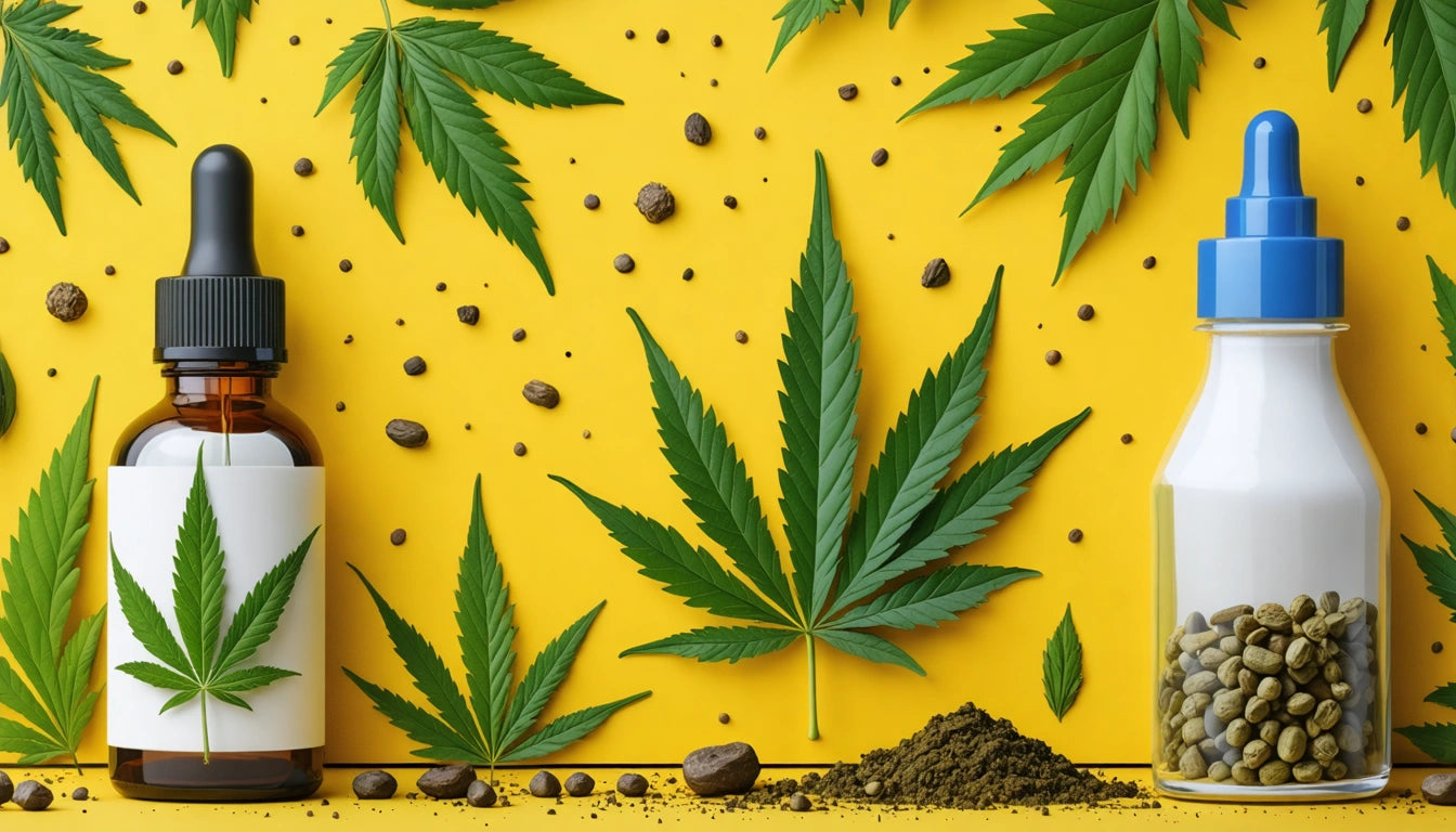
Successful cannabis brands understand that recall depends on creating distinctive assets that trigger memory. These assets include consistent color schemes, unique structural designs, and recognizable logos that stand out in a retail environment. Color psychology in packaging design plays a particularly important role in creating these memory associations.
Visual Elements That Drive Recognition
Color Strategy
Color is often the first element consumers notice and remember about packaging. Brands that own a distinctive color palette create a significant competitive advantage. For example, purple packaging often signals indica-dominant products, while bright yellows and oranges typically represent energizing sativas. This color coding creates intuitive navigation for consumers while building brand recognition.
Typography and Logo Design
Font choices dramatically impact how consumers perceive and remember your brand. Typography that resonates with cannabis consumers balances legibility with personality. Distinctive, consistent typography across all packaging creates a recognizable visual language that consumers can identify even from a distance.
Packaging Structure and Tactile Experiences
The physical form of packaging creates powerful memory associations through tactile experiences. The psychology of shapes in cannabis packaging reveals that unique structural designs can significantly boost recall. Whether using custom jars, distinctive tubes, or innovative pouches, the physical interaction with packaging creates multi-sensory memories.
Texture and finish also contribute substantially to brand recall. Many premium brands incorporate texture and finish effects like soft-touch coatings, embossing, or selective spot gloss to create distinctive tactile experiences. These sensory elements help maintain product freshness and quality, particularly when paired with humidity control solutions that preserve product integrity while reinforcing brand quality perceptions.
Consistency Across Product Lines
Brands with multiple product categories face the challenge of maintaining recognition while differentiating between product lines. Creating consistent packaging style guides ensures that core brand elements remain constant while allowing for product-specific variations.
Successful brands typically maintain a consistent design framework while using subtle visual cues to differentiate product categories:
- Consistent logo placement and size across all products
- Standard typography hierarchy for information organization
- Color-coding systems for different strains or effects
- Uniform structural elements with category-specific variations
Balancing Compliance with Memorability
Cannabis packaging must navigate strict regulatory requirements while maintaining distinctive design. Balancing compliance and creativity requires strategic design thinking. The most successful brands incorporate required warning labels and information into their overall design system rather than treating them as afterthoughts.
Market research shows that brands that integrate compliance elements seamlessly into their design language achieve better recall than those that simply add required elements without consideration for the overall visual impact. This integration creates a cohesive look that consumers can quickly recognize.
Strategic Recommendations for Lasting Brand Impact
To maximize brand recall in today's competitive cannabis market, consider these evidence-based approaches:
- Invest in proprietary structural packaging that creates distinctive shelf presence
- Develop a consistent visual system that works across multiple product categories
- Use visual storytelling techniques to communicate brand values authentically
- Consider regional preferences when designing for specific markets
- Design for both retail environments and social media shareability
- Test packaging designs in actual retail lighting conditions
The most memorable cannabis packaging strikes a balance between standing out and fitting in. It must be distinctive enough to be recognized but appropriate for the category to maintain credibility. By focusing on consistent visual systems, meaningful differentiation, and quality materials, brands can create packaging that consumers not only remember but actively seek out on crowded dispensary shelves.


Leave a comment
All comments are moderated before being published.
This site is protected by hCaptcha and the hCaptcha Privacy Policy and Terms of Service apply.