


The Most Overlooked Elements in Packaging Design
When brands focus on packaging design, they often prioritize colors, logos, and imagery while neglecting equally crucial elements that can significantly impact consumer perception and product success. These overlooked aspects of packaging design often make the difference between products that merely exist on shelves and those that actively engage consumers and drive purchasing decisions.
Tactile Elements: Beyond Visual Appeal
The physical feel of packaging creates a sensory experience that many brands underestimate. Texture variations can communicate quality and brand positioning without a single word. For example, selecting the right finish between matte, glossy, or soft-touch can dramatically alter perception.
Research shows that consumers spend up to 30% more time handling products with engaging tactile elements. Matte finishes have gained popularity for their sophisticated feel and fingerprint resistance, but many brands still default to standard glossy options without considering the strategic advantages of texture.
Innovative Texture Applications
Beyond basic finishes, selective texture application creates memorable packaging moments:
- Embossed logos that consumers can feel without looking
- Textured panels that guide hand placement during unboxing
- Contrasting smooth and textured areas that create visual-tactile harmony
These tactile elements work subconsciously, building brand recognition through physical interaction rather than visual cues alone.
Structural Integrity and Functionality
Packaging that fails its primary purpose of protection creates negative brand associations regardless of aesthetic appeal. Structural elements are frequently sacrificed for visual impact, resulting in damaged products and disappointed customers.
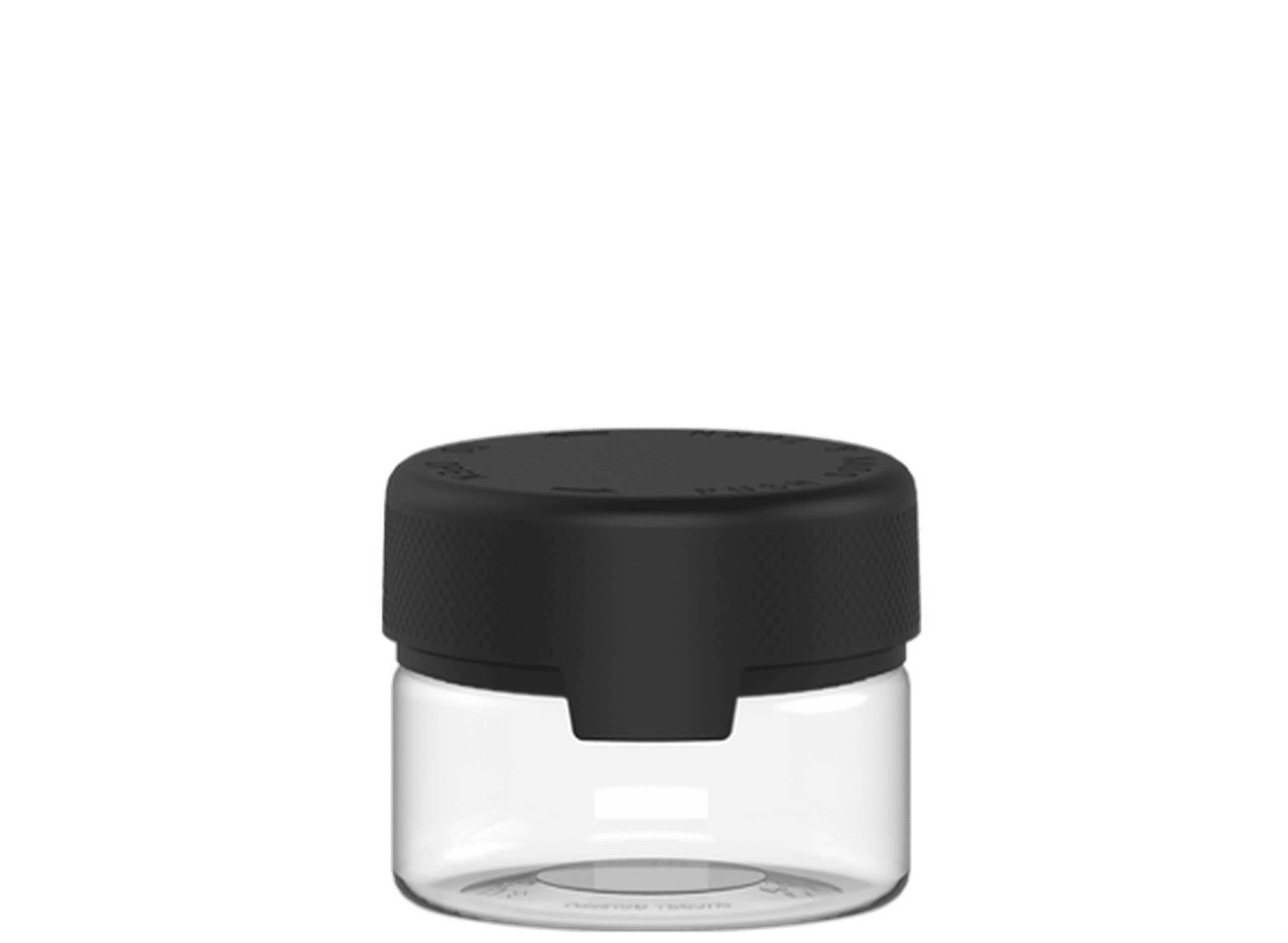
For cannabis products specifically, structural considerations extend beyond protection to include child-resistance, freshness preservation, and discreet transportation. Many brands exploring custom pre-roll packaging options focus primarily on graphics while overlooking critical structural features that ensure product integrity and compliance.
White Space and Breathing Room
Negative space remains one of the most underutilized design elements in packaging. Brands often feel compelled to fill every available surface with information, imagery, or decoration. However, strategic use of white space communicates confidence and premium positioning while improving information hierarchy.
The trend toward minimalism isn't merely aesthetic; it serves practical purposes:
- Improved readability of critical information
- Reduced cognitive load for consumers
- Greater visual impact of key brand elements
- Enhanced perception of quality and sophistication
As biophilic design gains traction in packaging, the strategic use of negative space becomes even more important to balance natural elements with functional information.
Typography Hierarchy and Readability
Typography often receives superficial attention, with brands selecting fonts for aesthetic appeal rather than functional communication. Effective packaging typography establishes clear hierarchies that guide consumers through information in order of importance.
Common typography oversights include:
- Poor contrast between text and background
- Insufficient size variation between primary and secondary information
- Decorative fonts that sacrifice readability for style
- Overcrowded text blocks without adequate spacing
The relationship between typography and color also demands careful consideration. Color trends like sunset gradients require thoughtful typography selection to maintain readability across color transitions.
Innovative Die Cuts and Structural Elements
Structural elements like die cuts offer functional and aesthetic benefits that many brands overlook. Clever die cuts can create product visibility, improve user experience, and differentiate products on crowded shelves.
These structural elements work in harmony with visual design to create cohesive brand experiences. For example, a die-cut window revealing product color can eliminate the need for printed color representation, reducing ink usage while improving authenticity.
Leveraging Overlooked Design Elements for Brand Success
The most successful packaging designs integrate overlooked elements with traditional focal points to create cohesive consumer experiences. This integration requires cross-functional collaboration between designers, structural engineers, and marketing teams.
Forward-thinking brands are now considering these elements from the earliest stages of product development rather than as afterthoughts in the design process. This holistic approach yields packaging that performs better on shelves and in consumers' hands.
As packaging design evolves, emerging color trends and hand-sketched aesthetics will continue to capture attention, but brands that master these overlooked elements will create more meaningful connections with consumers and stronger brand loyalty over time.


Leave a comment
All comments are moderated before being published.
This site is protected by hCaptcha and the hCaptcha Privacy Policy and Terms of Service apply.