


Table of Contents
The Psychology Behind Color Choices in Packaging
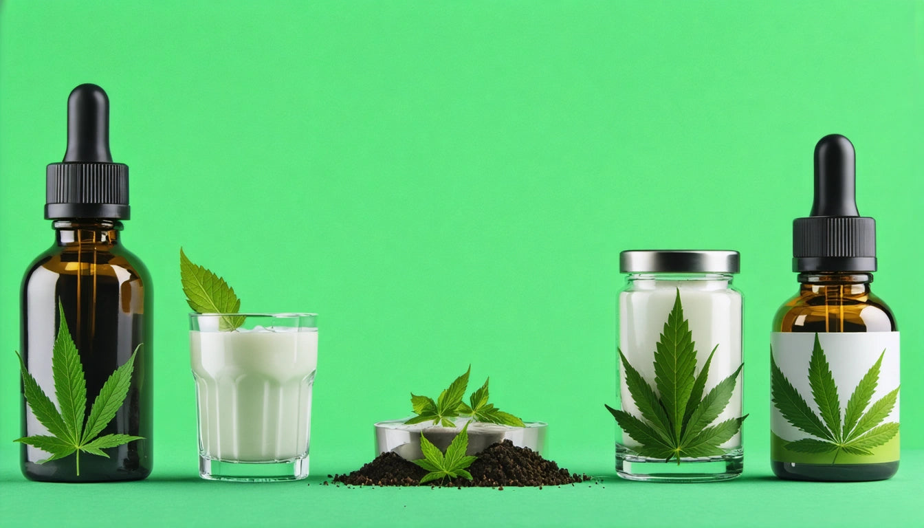
Color selection in packaging is far more than an aesthetic decision. It's a strategic marketing tool that directly impacts consumer perception, brand recognition, and purchasing behavior. In the cannabis industry, where visual differentiation is crucial in a competitive market, understanding the psychological impact of color choices can significantly influence a product's success.
Color Psychology Fundamentals in Packaging
Color psychology examines how different hues affect human behavior and emotional responses. When applied to packaging design, these principles can create powerful connections with consumers before they even interact with the product. According to research on color psychology in retail packaging, consumers make subconscious judgments about products within 90 seconds of initial viewing, with up to 90% of that assessment based solely on color.
The fundamental principles of color psychology in packaging include:
- Visual hierarchy and attention direction
- Brand personality communication
- Product category signaling
- Quality and value perception
Emotional Responses to Different Colors
Warm Colors
Red, orange, and yellow evoke excitement, urgency, and optimism. Red packaging can stimulate appetite and create a sense of immediacy, making it effective for impulse purchases. Orange combines red's energy with yellow's friendliness, creating an adventurous, affordable impression. Yellow captures attention with associations of happiness and optimism.
Cool Colors
Blue, green, and purple communicate tranquility, health, and luxury respectively. Blue builds trust and reliability, particularly effective for pharmaceutical and wellness products. Green signals natural, organic qualities, while purple conveys premium quality and exclusivity.
As explored in dopamine marketing research, certain color combinations can trigger neurological responses that create positive associations with products, literally making consumers feel good when they see your packaging.
How Color Reinforces Brand Identity
Consistent color application builds recognition and reinforces brand values. Major brands protect their signature colors through trademarks and strict usage guidelines. For cannabis brands, color selection should align with positioning strategy, whether emphasizing medicinal benefits, lifestyle enhancement, or premium quality.
When selecting equipment for processing and packaging operations, even the colors of machinery can influence perception. Our specialized processing equipment solutions are designed with both functionality and visual presentation in mind, understanding that every touchpoint affects brand perception.
Color Preferences Across Market Demographics
Color preferences vary significantly across demographic groups. Age, gender, education level, and cultural background all influence how consumers respond to different colors. Research indicates that:
- Younger consumers often respond positively to bright, bold colors
- Older demographics typically prefer subdued, traditional color schemes
- Gender-based preferences exist but are becoming less pronounced
- Educational background influences receptiveness to color sophistication
Understanding these variations allows brands to tailor packaging to target audiences. Studies on perceived value show that strategic color selection can enhance product perception without increasing production costs.
Cultural Considerations in Color Selection
Colors carry different meanings across cultures, making cultural context essential for brands with diverse or international markets. For example:
- White represents purity in Western cultures but mourning in some Eastern cultures
- Red symbolizes luck and prosperity in Chinese culture
- Purple has royal associations in many Western societies
- Yellow can signify courage in Japan but caution in Western contexts
These cultural nuances require careful consideration, especially for cannabis brands expanding into new markets with varying cultural attitudes toward cannabis itself.
Strategic Implementation of Color Psychology
Implementing color psychology effectively requires a methodical approach that considers product attributes, target audience, and competitive landscape. The process should include:
- Defining brand personality and values
- Identifying target audience preferences
- Analyzing competitor color schemes
- Testing color combinations with focus groups
- Ensuring consistency across packaging and marketing materials
The multisensory experience of packaging extends beyond visual elements to include texture and physical interaction. Research on texture psychology demonstrates how tactile elements work with color to create a complete sensory experience that influences consumer perception.
When combined with the excitement of product discovery, these elements create powerful psychological connections. The psychology of unboxing reveals how color choices contribute to anticipation and satisfaction during the product reveal process.
By understanding and strategically applying color psychology principles, cannabis brands can create packaging that not only protects and presents products effectively but also communicates brand values, influences purchasing decisions, and builds lasting consumer relationships through visual and emotional connections.


Leave a comment
All comments are moderated before being published.
This site is protected by hCaptcha and the hCaptcha Privacy Policy and Terms of Service apply.