Table of Contents
The visual elements of cannabis packaging do more than simply contain products. They communicate brand values, set consumer expectations, and influence purchasing decisions. Understanding the psychological impact of color choices and typography can help cannabis brands create packaging that resonates with target audiences and stands out in competitive dispensary environments.
Color Psychology in Cannabis Packaging
Color selection is perhaps the most immediate visual cue consumers process when evaluating cannabis products. Different colors evoke specific emotional and psychological responses that can align with or contradict a brand's intended positioning.
Green: Growth and Wellness
Unsurprisingly, green remains dominant in cannabis packaging, symbolizing nature, wellness, and the plant itself. Lighter greens often communicate freshness and accessibility, while deeper greens suggest premium quality and potency. As noted in this guide on custom packaging differentiation, brands seeking to stand out might consider complementary colors that maintain this natural association while adding distinction.
Purple and Blue: Relaxation and Premium Quality
Purple tones often signify indica-dominant strains and relaxation effects, while blue communicates calm, medicinal benefits, and trustworthiness. These colors appear frequently in packaging for sleep aids and anxiety-reducing products.
Orange and Yellow: Energy and Creativity
Bright, warm tones like orange and yellow signal sativa effects, daytime use, and creativity-enhancing properties. These colors can increase perceived energy and appeal to consumers seeking uplifting experiences.
Black and Metallic: Luxury and Potency
Dark packaging with metallic accents often positions products as premium, potent, or sophisticated. This approach works particularly well for concentrates and high-THC products targeting experienced consumers.
Typography and Brand Identity
Typography choices communicate brand personality and product positioning just as powerfully as color. Font selection affects readability, perceived quality, and brand recognition.
Serif vs. Sans-Serif Considerations
Traditional serif fonts often convey heritage, reliability, and medicinal qualities, making them suitable for brands emphasizing therapeutic benefits. Sans-serif fonts project modernity, accessibility, and straightforward information, aligning with recreational and lifestyle-oriented brands.
According to expert guidance on working with packaging designers, font selection should maintain consistency across product lines while ensuring legibility at various sizes, particularly for compliance information.
Visual Hierarchy and Consumer Attention
Effective cannabis packaging directs consumer attention to key information through strategic use of color contrast and typographic hierarchy. This is especially important given the limited time consumers spend evaluating products in retail environments.
Contrast and Focal Points
Strategic color contrast draws the eye to important elements like brand names, strain types, or THC percentages. High-contrast designs can also help products stand out on crowded dispensary shelves, where consumers may make decisions in seconds.
Whitespace and Information Processing
Adequate whitespace improves information processing and perceived quality. Cluttered designs with minimal whitespace can overwhelm consumers and suggest lower quality, regardless of the actual product inside. When designing jar packaging, even the closure systems and lid designs contribute to the overall visual impression and functionality, affecting how consumers interact with the product.
Color and Typography Across Product Segments
Different cannabis product categories benefit from tailored design approaches that align with consumer expectations and usage contexts.
- Flower packaging often emphasizes strain characteristics through color coding (greens and purples for indica, yellows and oranges for sativa) and transparent elements to showcase the product.
- Edibles packaging frequently borrows from mainstream food design conventions while incorporating cannabis-specific information hierarchies.
- Concentrates packaging tends toward premium, scientific, or technical design elements that communicate potency and purity.
- Vape packaging often adopts sleek, minimalist approaches that align with technology and lifestyle positioning.
Category-specific packaging strategies can help brands align with consumer expectations while still maintaining distinctive brand identities.
Practical Design Considerations
Beyond psychology, practical factors influence color and typography decisions in cannabis packaging design.
Compliance and Legibility
Warning labels, THC symbols, and other required elements must maintain legibility regardless of design choices. Balancing compliance with creativity requires understanding regulatory requirements and planning visual hierarchies accordingly.
Print Processes and Material Interactions
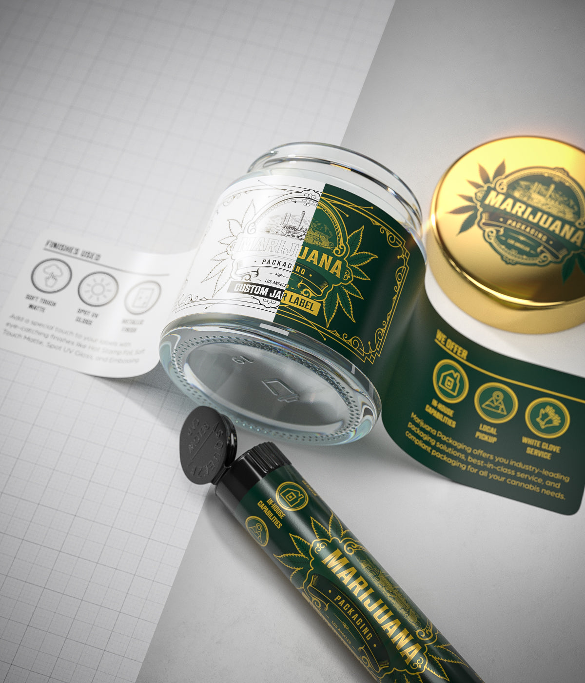
Color reproduction varies across different materials and printing methods. Certain premium finishes like foil stamping, embossing, and UV spot treatments can enhance perceived value but require careful color and typography planning.
Future Design Innovations in Cannabis Packaging
As the cannabis industry matures, packaging design continues to evolve beyond basic color and typography considerations. Emerging trends include interactive elements that engage consumers beyond the point of purchase, augmented reality features accessible through smartphones, and designs that transform for secondary uses after the product is consumed.
Sustainable design approaches are also gaining prominence, with brands using color and typography to communicate environmental values through packaging that tells sustainability stories. This reflects growing consumer preference for brands that align with personal values beyond the product experience itself.
The most successful cannabis brands will continue to leverage color psychology and typography not just as aesthetic choices, but as strategic tools that shape consumer perception and create memorable brand experiences from shelf to social media.






Leave a comment
All comments are moderated before being published.
This site is protected by hCaptcha and the hCaptcha Privacy Policy and Terms of Service apply.