


Table of Contents
The Ultimate Guide to Color Pairing: Exploring Green and Its Complementary Shades
Green represents nature, growth, and harmony, making it a versatile color for design, fashion, and home decor. Understanding what colors look good with green can transform ordinary spaces and products into visually stunning creations. This guide explores various green shades and their ideal color companions to help you make informed design decisions.
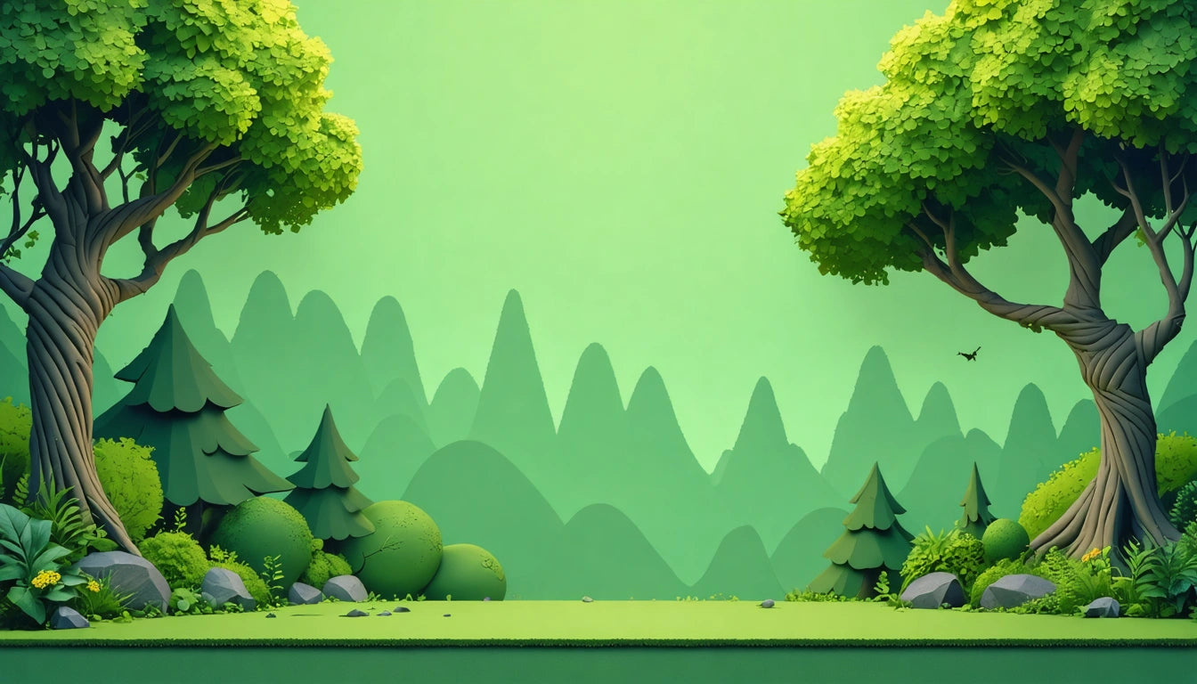
Understanding Green: From Forest to Lime
Green exists in countless variations, each with unique characteristics and pairing potential. Forest green, a deep, rich shade reminiscent of dense woodlands, carries a sophisticated, grounding energy. Light green evokes freshness and vitality, while lime green brings vibrant energy to any palette.
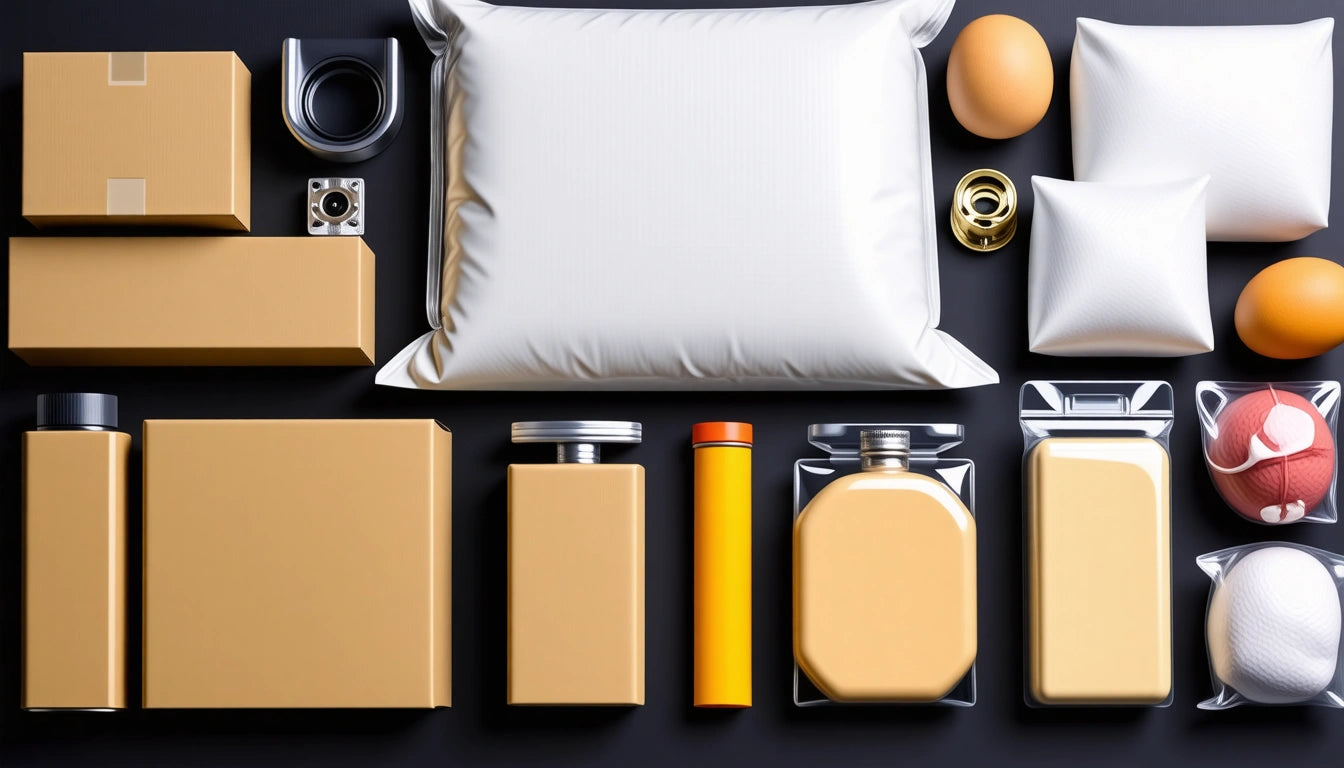
According to color psychology experts, forest green is often associated with wealth, stability, and endurance. This makes it particularly popular in premium packaging solutions that require both security and style, where the color conveys reliability alongside visual appeal.
Popular Green Shades
- Forest Green: A deep, rich green that mimics the color of pine forests
- Sage Green: A muted, grayish-green with earthy undertones
- Emerald Green: A bright, jewel-toned green with blue undertones
- Lime Green: A vibrant, yellowish-green that brings energy
- Mint Green: A light, refreshing green with cool undertones
When considering what color is forest green exactly, it's typically defined as a dark green with hints of blue and yellow, creating a rich, natural tone that works well in both traditional and contemporary settings.
Complementary Colors: What Goes Well With Green
Understanding color theory helps identify what colors look good with green. The color wheel places red directly opposite green, making them complementary colors that create maximum contrast and visual interest when paired.
Classic Combinations
Red and green create a striking contrast, but this pairing requires careful balance to avoid a seasonal or Christmas-like appearance. For a more sophisticated approach, try maroon with forest green, which creates an elegant, rich combination suitable for luxury branding.
What color goes well with maroon? Green, particularly in its deeper shades, complements maroon beautifully, creating a rich, sophisticated palette that works well in fashion, interior design, and product packaging.
Neutral Partners
Green pairs exceptionally well with neutrals:
- White: Creates a fresh, clean look
- Black: Adds sophistication and depth
- Beige: Offers warmth and subtlety
- Gray: Provides a modern, balanced foundation
These neutral companions allow green to stand out while maintaining visual harmony, making them ideal for minimalist designs or when green serves as an accent color.
Specific Green Pairings: Forest, Light, and Lime Green
Different green shades require different complementary colors to achieve optimal visual harmony.
Forest Green Combinations
What color goes good with forest green? This deep, rich shade pairs beautifully with:
- Gold and brass metallics
- Cream and ivory
- Burgundy and wine tones
- Navy blue for a classic look
For a contemporary approach, pairing forest green with coral or peach creates unexpected visual interest while maintaining sophistication.
Light Green Partnerships
What colors look good with light green? This refreshing shade harmonizes with:
- Lavender and lilac
- Soft blues and aqua
- Warm neutrals like taupe
- Pink in various intensities
Light green offers versatility in both modern and traditional settings, making it a favorite for spaces aiming to feel both fresh and timeless.
Lime Green Accents
Wondering what color looks good with lime green? This vibrant shade pairs well with:
- Deep purple for dramatic contrast
- White for clean, contemporary looks
- Charcoal gray for balance
- Turquoise for energetic spaces
Lime green functions best as an accent color rather than a dominant tone in most design applications.
Color Mixing Techniques: Creating Custom Green Shades
Understanding how to create custom green shades expands your design possibilities tremendously.
Creating Forest Green
Curious about how to make forest green color? Typically, you'll start with a base green and add small amounts of blue and black to deepen the tone. For precise color mixing:
- Start with a medium green
- Add blue to cool the tone
- Incorporate small amounts of black to darken
- If it becomes too dark, add a touch of yellow to brighten
The exact proportions depend on your starting materials and desired outcome, but patience and incremental adjustments yield the best results.
Custom Green Variations
For custom green shades, remember that green results from mixing blue and yellow. Adjusting the ratio creates different green variations:
- More yellow creates lime and chartreuse greens
- More blue produces teal and aqua greens
- Adding white lightens any green shade
- Adding black or complementary red darkens green
Experimenting with different mixing techniques allows you to develop signature green shades for your specific design needs.
Popular Green Applications in Design and Packaging
Green's versatility makes it a staple in various design applications, from branding to interior spaces.
What is the most popular shade of green? According to design industry surveys, sage green currently holds this title, with its muted, sophisticated character making it adaptable to numerous contexts. Forest green follows closely behind, particularly in luxury and heritage branding.
In packaging design, green communicates natural ingredients, sustainability, and wellness. The specific shade choice significantly impacts consumer perception, with darker greens suggesting premium quality and lighter greens conveying freshness.
For those wondering about other color relationships, what is panama red? While not directly related to green, panama red refers to a reddish-brown shade with warm undertones that can complement certain green varieties, particularly forest and olive greens.
Similarly, what color is real salmon? True salmon color is a pinkish-orange hue that pairs beautifully with many green shades, especially sage and mint green, creating a natural, harmonious combination inspired by garden settings.
Green's adaptability and psychological associations with growth and renewal ensure its continued popularity across design disciplines, while understanding its complementary relationships enhances its effectiveness in any visual communication.


Leave a comment
All comments are moderated before being published.
This site is protected by hCaptcha and the hCaptcha Privacy Policy and Terms of Service apply.