Table of Contents
Understanding Periwinkle Color: Identification and Creation
Periwinkle is a delicate color that often leaves people wondering exactly where it sits in the color spectrum. Is it blue? Is it purple? This guide will help you identify what color periwinkle is and provide detailed instructions on how to make periwinkle color for your artistic and design projects.
What is Periwinkle: Identifying This Delicate Hue
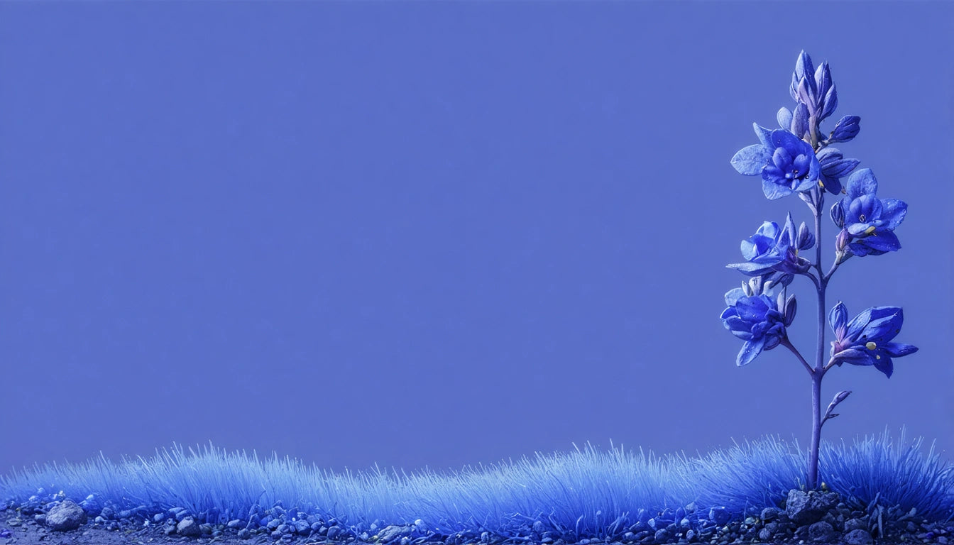
Periwinkle is a light, bluish-purple color that takes its name from the periwinkle flower (Vinca minor). When someone asks to show me periwinkle color, I point to a shade that sits between lavender and light blue on the color spectrum. In technical terms, periwinkle is often described as a pastel blue with violet undertones.
The hex code for a standard periwinkle color is #CCCCFF, though variations exist. This color has a gentle, soothing quality that makes it popular in both fashion and interior design. Many people find periwinkle appealing because it combines the calmness of blue with the gentle energy of purple.
Periwinkle in Color Theory: Where It Fits
Understanding where periwinkle sits in color theory helps explain its unique properties. As explored in this guide on primary, secondary, and tertiary colors, periwinkle falls into the tertiary category. It's created by mixing primary and secondary colors rather than being a pure primary or secondary color itself.
Periwinkle is considered a tint of blue-violet, meaning it's blue-violet with white added to lighten it. This positioning gives periwinkle its characteristic softness while maintaining the cool temperature associated with blues and purples.
How to Make Periwinkle Color: Mixing Techniques
If you're wondering how to make periwinkle color, you'll be pleased to know it's relatively straightforward with the right approach. Here are the basic methods:
Basic Periwinkle Mixing Formula
- Mix blue and purple in approximately a 3:1 ratio
- Add white to lighten until you reach the desired periwinkle shade
- Adjust with tiny amounts of red if needed to warm the tone slightly
For more precise results, try this specific formula:
- 2 parts ultramarine blue
- 1 part violet or purple
- 3-4 parts white (adjust for desired lightness)
Digital designers can create periwinkle by using RGB values of approximately R:204, G:204, B:255. As noted in this resource on mastering paint mixing, achieving consistent results requires practice and careful measurement.
Periwinkle Color Combinations: Complementary and Harmonious Pairings
Periwinkle works beautifully with many other colors. For harmonious combinations, consider these pairings:
Complementary Combinations
- Periwinkle + Soft Yellow (creates a subtle contrast)
- Periwinkle + Coral (vibrant yet balanced pairing)
- Periwinkle + Sage Green (natural, calming combination)
Analogous Combinations
- Periwinkle + Lavender + Light Blue (creates a soothing gradient effect)
- Periwinkle + Sky Blue + Soft Pink (creates a dreamy palette)
Similar to the approaches discussed in this article on complementary colors, finding the right periwinkle combinations involves understanding color relationships and the emotional responses they evoke.
When using periwinkle in design projects, many professionals find that it pairs exceptionally well with neutral tones like beige, as discussed in this exploration of beige. The softness of both colors creates a sophisticated, calming aesthetic.
Practical Applications of Periwinkle in Design and Art
Periwinkle's versatility makes it valuable across numerous applications. In interior design, it creates serene spaces without the intensity of deeper blues or purples. In fashion, periwinkle conveys a gentle sophistication that works year-round.
For artists and designers working on custom projects, periwinkle can be incorporated into various materials. For instance, when creating custom packaging with personalized color schemes, periwinkle offers a distinctive option that stands out while maintaining visual appeal.
The color also has psychological associations worth considering. Periwinkle tends to evoke feelings of serenity, nostalgia, and creativity, making it particularly effective for products or spaces designed to promote relaxation or artistic expression.
When working with periwinkle in digital design, it's important to account for how screens display this delicate color. What appears as periwinkle on one device might look more blue or purple on another due to different color calibrations. Professional designers often specify exact color values to maintain consistency across platforms.
For those interested in exploring color mixing further, this guide on creating yellow offers complementary insights into the art of color formulation that can be applied to periwinkle and other custom colors.
Whether you're an artist, designer, or simply a color enthusiast, understanding what color periwinkle is and how to create it opens up new possibilities for your creative palette. Its gentle presence and versatile nature make it a valuable addition to any color repertoire.


Leave a comment
All comments are moderated before being published.
This site is protected by hCaptcha and the hCaptcha Privacy Policy and Terms of Service apply.