


Table of Contents
- Color Psychology and Its Impact on Hemp Packaging
- Green and Earth Tones: Communicating Sustainability
- White and Minimalist Designs: Purity and Transparency
- Vibrant Colors: Standing Out in a Crowded Market
- Strategic Color Combinations for Different Hemp Products
- Implementation Strategies for Effective Color Selection
The Best Colors for Hemp Packaging According to Consumer Psychology
Color selection for hemp packaging goes beyond aesthetics. It directly influences consumer perception, purchase decisions, and brand positioning in an increasingly competitive market. Understanding the psychological impact of different color choices can help hemp brands communicate their values effectively while appealing to their target demographic.
Color Psychology and Its Impact on Hemp Packaging
Research in consumer psychology consistently shows that color influences up to 90% of initial product assessments. For hemp products, where regulatory scrutiny and consumer education remain ongoing challenges, strategic color selection becomes even more critical.
According to consumer psychology studies on hemp packaging, colors trigger specific emotional and cognitive responses that can either align with or contradict a brand's intended messaging. The right color palette can communicate product benefits, sustainability credentials, and quality assurance without relying on explicit claims that might raise compliance concerns.
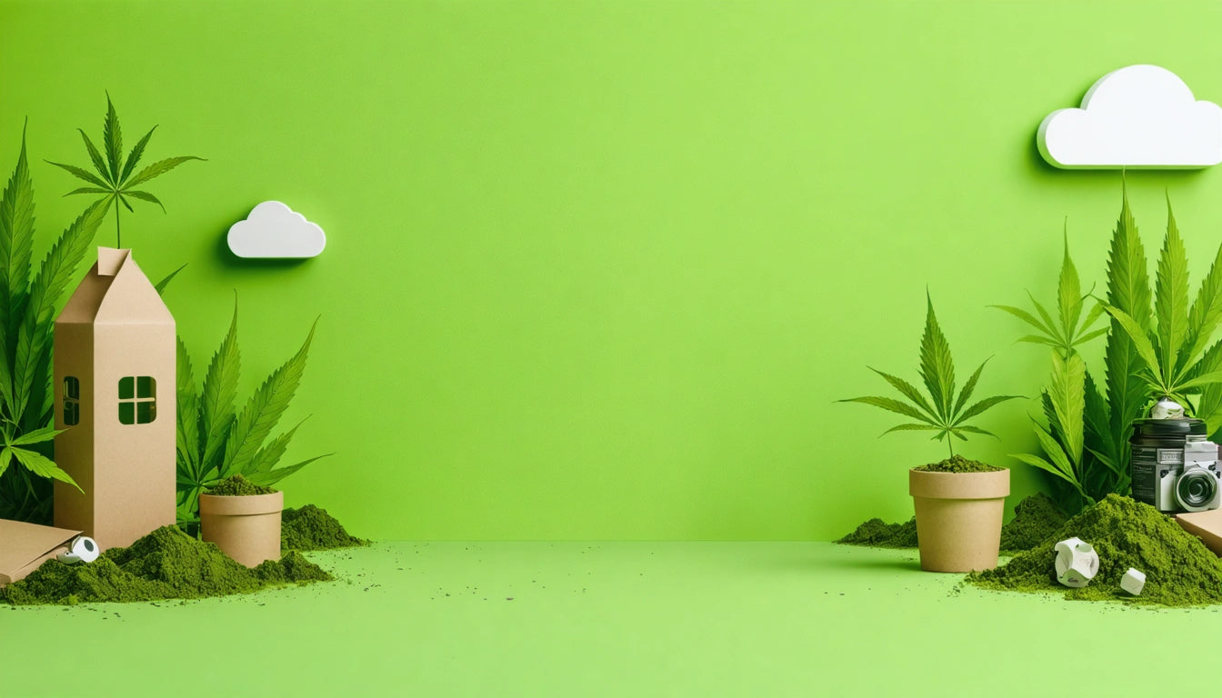
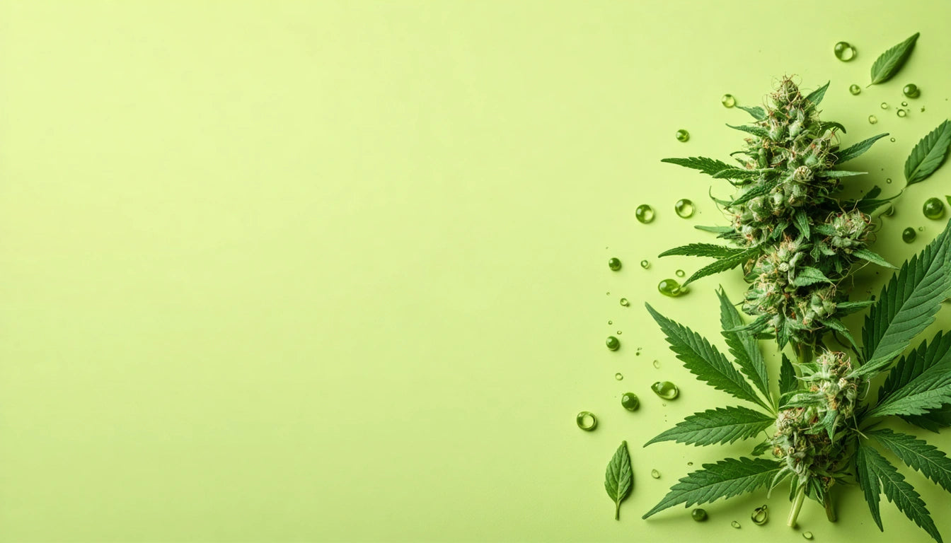
Green and Earth Tones: Communicating Sustainability
Unsurprisingly, green dominates the hemp packaging landscape, particularly for products emphasizing sustainability credentials. Different shades of green evoke distinct responses:
- Sage and olive greens suggest natural, unprocessed quality
- Forest greens convey established authority and tradition
- Bright greens signal innovation and freshness
Earth tones like browns, tans, and beiges complement green palettes while reinforcing the connection to sustainable hemp packaging materials. These colors visually communicate biodegradability and eco-friendliness, important attributes for environmentally conscious consumers.
White and Minimalist Designs: Purity and Transparency
White and minimalist color schemes have gained significant traction in hemp packaging, particularly for wellness-oriented products. White communicates:
- Clinical purity and laboratory testing
- Transparency in ingredients and sourcing
- Premium positioning and quality assurance
For hemp-derived cannabinoid products that require careful labeling to avoid regulatory issues, white backgrounds provide clarity for important information while suggesting pharmaceutical-grade quality.
Many brands pair white with a single accent color to create recognition while maintaining the clean aesthetic. This approach works particularly well for hemp products targeting health-conscious consumers or those new to hemp-derived goods.
Vibrant Colors: Standing Out in a Crowded Market
As the hemp market matures, some brands opt for vibrant, unexpected color choices to differentiate themselves. Bold purples, blues, and even oranges can help products stand out on shelves while communicating specific attributes:
- Purple suggests calming properties and premium quality
- Blue conveys trustworthiness and stability
- Orange and yellow signal energy and optimism
These vibrant choices work particularly well for hemp products targeting younger demographics or specialized use cases. When implementing humidity control solutions like specialized humidity regulation packs for preserving hemp flower quality, packaging with vibrant colors can help highlight these value-added features.
Strategic Color Combinations for Different Hemp Products
Different hemp product categories benefit from specific color strategies:
Hemp Textiles and Clothing
Natural, undyed appearances with minimal color intervention communicate authenticity and sustainability. When colors are used, they tend toward muted earth tones that highlight the natural fiber characteristics.
Hemp-Based Foods
Green and brown combinations suggest nutritional benefits, while cream backgrounds with green accents communicate clean ingredients. Packaging for hemp seeds and proteins often features transparent elements to showcase the actual product.
Hemp-Derived Cannabinoids
Products containing CBD, Delta-8, or other hemp-derived cannabinoids typically employ more sophisticated color schemes. Blues and greens suggest therapeutic benefits, while white and black combinations signal premium positioning.
Industrial Hemp Products
Packaging for industrial applications often uses practical colors like kraft brown combined with simple one or two-color printing, emphasizing functionality and sustainability over marketing appeal.
Implementation Strategies for Effective Color Selection
When implementing color psychology principles for hemp packaging, consider these practical approaches:
- Test multiple color variations with target consumer groups before full production
- Ensure colors maintain their integrity across different packaging materials, especially hemp-based plastics which may render colors differently than traditional materials
- Consider how colors appear under different retail lighting conditions
- Maintain color consistency across product lines to build brand recognition
- Evaluate how colors translate to online shopping environments where most hemp product discovery occurs
The most successful hemp brands develop comprehensive color strategies that align with their broader brand positioning while communicating key product attributes. By understanding the psychological impact of different colors, manufacturers can create packaging that resonates with consumers while supporting sustainability goals and regulatory compliance.


Leave a comment
All comments are moderated before being published.
This site is protected by hCaptcha and the hCaptcha Privacy Policy and Terms of Service apply.