


Table of Contents
- Color Systems Overview: Pantone and CMYK Fundamentals
- The Pantone Color System: Standardized Color Matching
- The CMYK Color System: Process Color Printing
- Key Differences Between Pantone and CMYK
- Choosing the Right Color System for Your Project
- Practical Applications in Cannabis Packaging
- Future Color Trends and Technology in Cannabis Branding
Pantone vs. CMYK: Understanding Color Systems in Printing
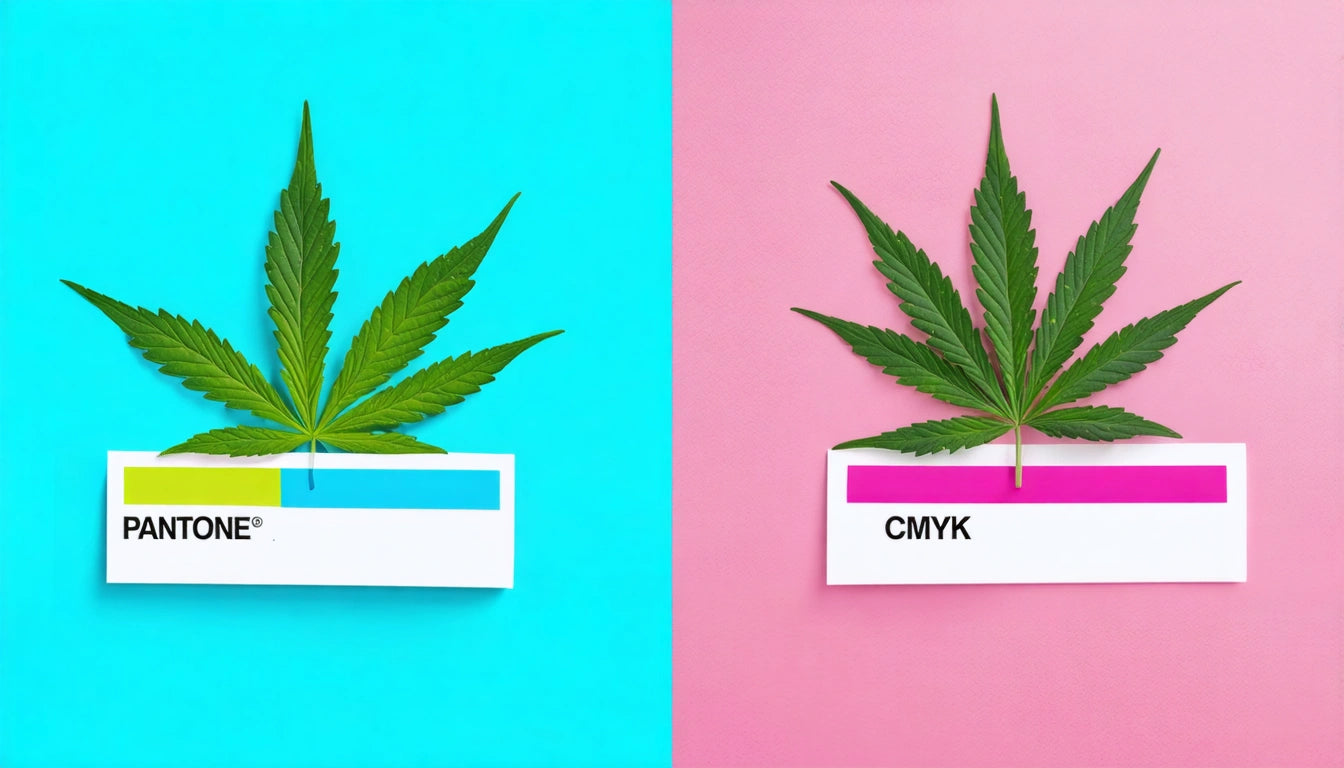
When designing cannabis packaging, understanding color systems is crucial for achieving consistent, eye-catching results. The two primary color systems in printing, Pantone and CMYK, serve different purposes and offer distinct advantages depending on your project requirements. This guide explores the differences between Pantone vs CMYK, helping you make informed decisions for your cannabis brand's visual identity.
Color Systems Overview: Pantone and CMYK Fundamentals
Color reproduction in printing relies on standardized systems to ensure consistency across different materials and printing methods. The two dominant systems in commercial printing are Pantone (PMS or Pantone Matching System) and CMYK (Cyan, Magenta, Yellow, and Key/Black). Each system approaches color reproduction differently, with unique strengths and limitations that impact packaging design decisions.
According to our guide on color models, understanding these systems is essential for achieving accurate brand colors and avoiding costly reprints. Cannabis brands with specific color requirements need to consider which system best serves their packaging needs.
The Pantone Color System: Standardized Color Matching
What is Pantone?
The Pantone Matching System is a standardized color reproduction system that uses numbered swatches to identify specific colors. Each Pantone color has a unique formula that printers worldwide can reference to achieve consistent results.
How Many Pantone Colors Are There?
The Pantone system contains over 2,000 standardized colors in its primary library. The company regularly updates its collections, adding new colors and specialized palettes for different industries and applications. The extensive range allows for precise color matching beyond what's possible with process printing.
Advantages of Pantone
- Consistent color reproduction across different print runs
- Ability to produce colors outside the CMYK gamut, including metallics and fluorescents
- Precise brand color matching for logos and identity elements
- Clear communication between designers and printers
The CMYK Color System: Process Color Printing
CMYK, also known as four-color process printing, creates colors by combining varying percentages of Cyan, Magenta, Yellow, and Black inks. This system is the standard for full-color printing, including photographs and complex designs with color gradients.
When comparing CMYK vs Pantone, it's important to understand that CMYK is a subtractive color model where inks absorb (subtract) light wavelengths. The combination of these four inks can reproduce a wide range of colors, though not as extensive as what's possible with Pantone.
Advantages of CMYK
- Cost-effective for full-color printing
- Ideal for photographic images and gradients
- Widely supported by all printing equipment
- No need for special inks or setup
For cannabis brands managing their production costs while maintaining quality, precision measurement tools like digital scales help ensure accurate ink mixing and consistent color application during the printing process.
Key Differences Between Pantone and CMYK
Color Accuracy and Consistency
When comparing Pantone or CMYK for your cannabis packaging, consider that Pantone offers greater color consistency across different print runs and materials. CMYK colors may vary slightly between printers and paper stocks, which can be problematic for brand-specific colors.
Color Range
Pantone can produce colors that CMYK cannot, particularly vibrant oranges, certain blues, and specialty finishes like metallics. This expanded range, as explained in our article on spot color vs. process color, allows for more distinctive packaging designs.
Cost Considerations
Printing Pantone vs CMYK has significant cost implications:
- CMYK is generally more economical for full-color designs
- Pantone requires special inks and additional setup, increasing costs
- For large print runs, the cost difference between systems becomes less significant
Choosing the Right Color System for Your Project
Selecting between Pantone and CMYK depends on several factors:
When to Use Pantone
- Brand identity elements requiring exact color matching
- Packaging with one to three solid colors
- Projects requiring specialty inks (metallics, fluorescents)
- When color consistency across different materials is crucial
When to Use CMYK
- Full-color photographic images
- Designs with gradients or color transitions
- Budget-conscious projects
- Digital printing applications
Many cannabis brands use a hybrid approach, printing logos and brand colors in Pantone while using CMYK for photographic elements. This strategy, as detailed in our guide on color mixing techniques, maximizes brand consistency while managing costs.
Practical Applications in Cannabis Packaging
Brand Identity and Recognition
Cannabis brands often develop distinctive color palettes to stand out in dispensary environments. Pantone colors ensure that your brand's signature hues remain consistent across packaging formats, from flower containers to pre-roll tubes.
Compliance Considerations
When designing cannabis packaging, color accuracy for warning symbols and compliance information is critical. Pantone colors can ensure that required elements meet regulatory standards consistently, while CMYK is suitable for product imagery and secondary design elements.
Material Compatibility
Different packaging materials interact with inks differently. Understanding how colors appear on various substrates is essential when choosing between printing Pantone vs CMYK. Some materials may require specific color systems to achieve desired results, particularly for specialty finishes like soft-touch coatings or metallic effects.
Future Color Trends and Technology in Cannabis Branding
The cannabis industry continues to evolve in its approach to color and branding. Emerging technologies are bridging the gap between Pantone and CMYK systems, offering new possibilities for cannabis packaging designers.
Digital printing advancements now allow for expanded color gamuts beyond traditional CMYK, while new specialty inks are making Pantone-like effects more accessible. For cannabis brands looking to stay ahead of trends, understanding both systems and their evolving capabilities is essential for creating packaging that resonates with consumers and maintains brand integrity across all touchpoints.
Whether you choose Pantone or CMYK ultimately depends on your specific brand requirements, budget constraints, and design objectives. By understanding the strengths and limitations of each system, you can make informed decisions that enhance your cannabis packaging's visual impact and brand consistency.


Leave a comment
All comments are moderated before being published.
This site is protected by hCaptcha and the hCaptcha Privacy Policy and Terms of Service apply.