Table of Contents
In the rapidly evolving cannabis industry, packaging design serves as a critical touchpoint between brands and consumers. Color psychology plays a fundamental role in this relationship, influencing perception, communicating product effects, and driving purchasing decisions. Understanding how different hues impact consumer behavior can help cannabis brands create more effective packaging strategies in an increasingly competitive marketplace.
Color Psychology Fundamentals in Cannabis Packaging
Color choices in cannabis packaging communicate specific messages about product attributes and expected effects. Green, the industry's traditional color, evokes naturalness and wellness, while purple suggests premium quality and relaxation. Blue conveys reliability and calmness, making it ideal for sleep-focused products. Meanwhile, bright oranges and yellows signal energy and creativity, perfect for uplifting sativa varieties.
According to research on color psychology in cannabis packaging, consumers form impressions within 90 seconds of viewing a product, with up to 90% of that assessment based solely on color. This makes strategic color selection essential for effective shelf presence and brand recognition.
Strategic Color Applications for Cannabis Categories
Flower Packaging
For flower products, color schemes often reflect strain characteristics. Indica-dominant strains frequently feature deep purples, blues, and dark greens to communicate relaxation and sedative effects. Sativa varieties benefit from vibrant yellows, oranges, and bright greens that suggest energy and creativity. Hybrid strains typically utilize balanced color combinations that reflect their mixed effects profile.
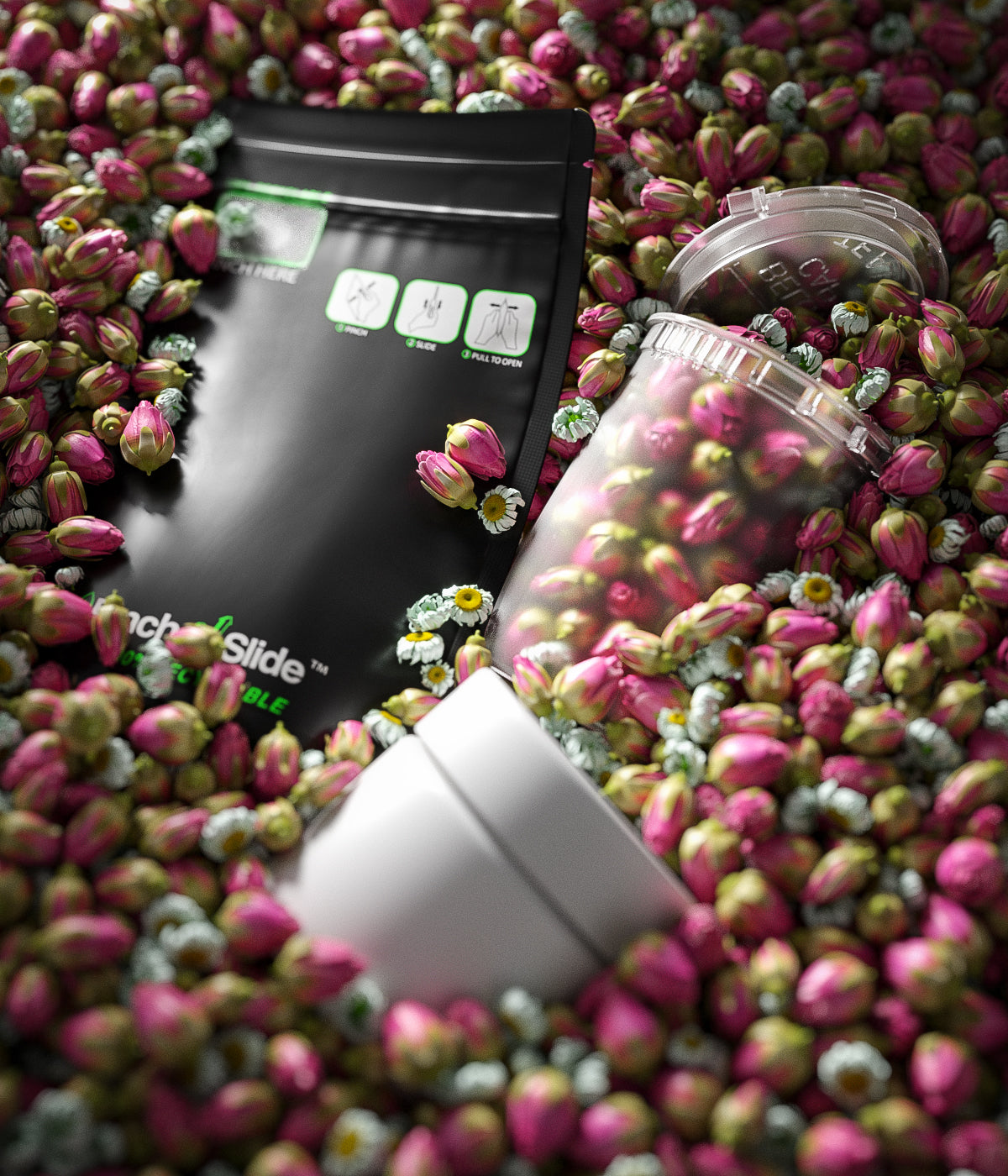
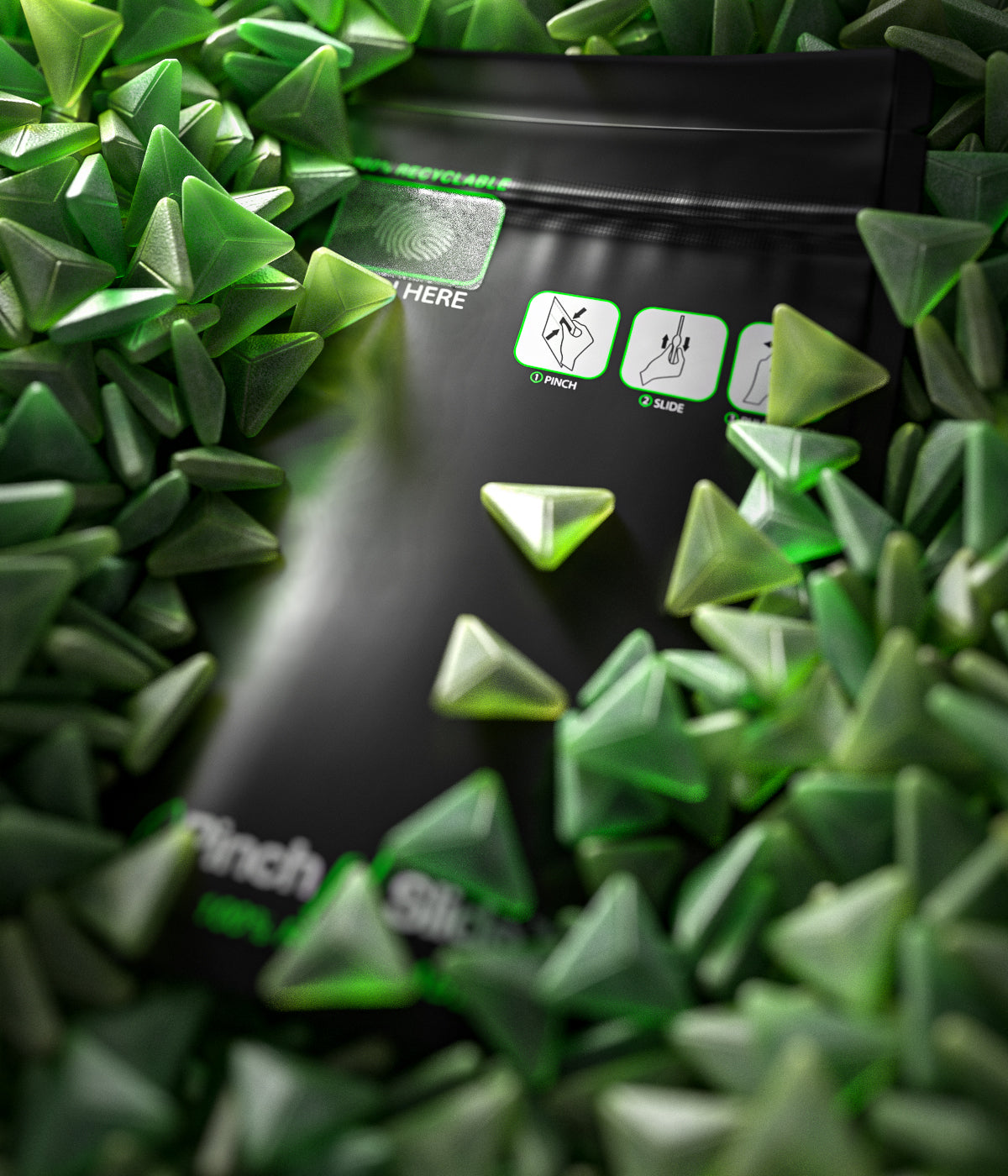
Many brands are finding success with custom-printed mylar bags for eighth quantities that use color strategically to differentiate strains while maintaining brand consistency. These packaging solutions allow for vivid color reproduction that stands out on dispensary shelves.
Edibles and Concentrates
Edibles packaging often incorporates food-associated colors that trigger appetite and enjoyment. Warm reds and oranges stimulate hunger, while browns and golds suggest richness and indulgence. For concentrates, amber and gold tones communicate purity and potency, with accent colors differentiating product types and effects.
Balancing Color Appeal with Regulatory Compliance
While creative color use drives consumer engagement, cannabis brands must navigate strict regulatory guidelines that vary by market. Many jurisdictions restrict colors that might appeal to children or create confusion with non-cannabis products. Balancing compliance and creativity requires thoughtful color strategies that remain attractive while adhering to regulations.
Successful approaches include:
- Using sophisticated color palettes that appeal to adult sensibilities
- Incorporating compliant warning colors effectively
- Creating contrast between brand colors and required warning elements
- Developing market-specific color variations for multi-state operations
Using Color to Establish Brand Identity
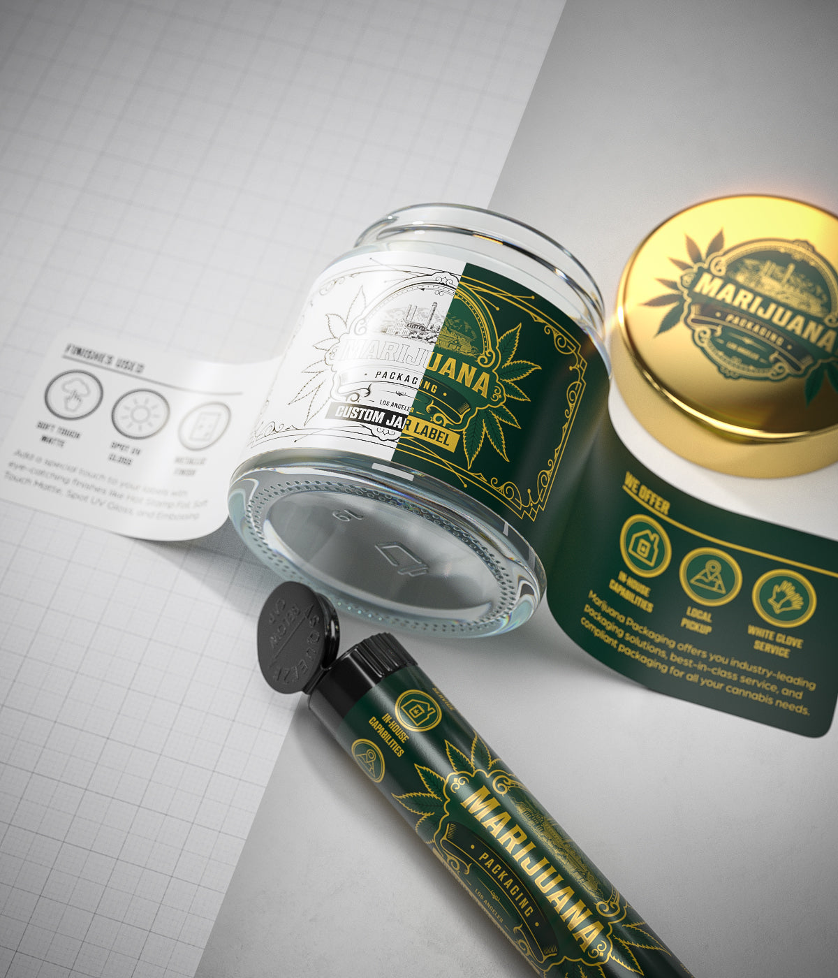
Consistent color application builds brand recognition and communicates brand values. Premium cannabis brands often employ minimalist color schemes with abundant white space, metallic accents, and subtle color pops to signal luxury and quality. Wellness-focused brands frequently utilize soft greens, blues, and earth tones to evoke natural healing properties.
Color consistency across product lines creates visual cohesion while allowing for category differentiation. Creating comprehensive style guides helps maintain this balance, especially as brands expand their product offerings.
Color Trends and Innovations in Cannabis Packaging
The cannabis industry continues to evolve in its color application, with several emerging trends shaping packaging design:
Regional Color Preferences
Color preferences show distinct regional patterns. West Coast markets often embrace bold, vibrant colors reflecting their established cannabis culture, while East Coast markets tend toward sophisticated, pharmaceutical-inspired palettes that communicate legitimacy and professionalism. Understanding these regional design preferences allows brands to tailor their approach to specific markets.
Innovative Color Technologies
Beyond traditional color application, cannabis brands are exploring innovative technologies including:
- Thermochromic inks that change color with temperature
- UV-reactive elements that reveal hidden designs under certain lighting
- Sustainable, plant-based pigments that align with eco-conscious brand values
- Textural color treatments that add tactile dimensions to packaging
These innovations not only enhance shelf appeal but also create memorable unboxing experiences that consumers are likely to share on social media, extending brand reach organically.
Strategic Implementation for Brand Success
For cannabis brands looking to leverage color psychology effectively, the process should begin with clear identification of target consumers and desired product positioning. Color strategy should align with overall brand values while differentiating products within the competitive landscape. Regular testing and refinement based on consumer feedback and sales data will help optimize color applications for maximum impact.
As the cannabis industry matures, sophisticated color strategies will become increasingly important for brand differentiation and consumer connection. Brands that thoughtfully apply color psychology principles while navigating regulatory requirements will create more compelling packaging that resonates with consumers and drives long-term loyalty in this dynamic marketplace.





Leave a comment
All comments are moderated before being published.
This site is protected by hCaptcha and the hCaptcha Privacy Policy and Terms of Service apply.