Table of Contents
In the competitive cannabis market, packaging isn't just a container, it's a powerful brand ambassador. A comprehensive packaging style guide ensures your products maintain visual consistency across various formats, helping customers instantly recognize your brand on crowded dispensary shelves. This strategic approach to packaging design combines brand storytelling with practical compliance considerations.
What is a Packaging Style Guide?
A packaging style guide is a detailed document that outlines the visual standards for your cannabis brand's packaging. It serves as a reference for designers, marketers, and production teams to maintain brand consistency across all product lines. This guide typically includes color specifications, typography rules, logo usage guidelines, and packaging material standards.
Unlike general brand guidelines, packaging style guides address specific considerations for three-dimensional objects that must meet regulatory requirements while effectively communicating brand values. According to our resource on packaging style guides, brands with consistent visual identity enjoy 33% higher customer recognition than those with inconsistent packaging.
Essential Components of Cannabis Packaging Style Guides
Color Palette and Psychology
Your color palette is perhaps the most immediately recognizable element of your packaging. Color psychology in cannabis packaging plays a crucial role in communicating product effects and brand positioning. For example, greens and blues often suggest natural or calming products, while vibrant purples and oranges might indicate more energetic experiences.
When defining your color palette, include:
- Primary and secondary colors with exact Pantone, CMYK, RGB, and HEX codes
- Acceptable color combinations and proportions
- Background and accent color specifications
- Guidance for color usage across different product categories
Typography and Hierarchy
Consistent typography enhances readability and brand recognition. Your style guide should specify:
- Primary and secondary font families
- Font sizes for different packaging elements (product name, strain, THC content)
- Typographic hierarchy for information organization
- Spacing and alignment rules
Typography choices significantly impact consumer perception, with serif fonts often conveying tradition and trust, while sans-serif fonts project modernity and accessibility.
Balancing Compliance with Brand Identity
Cannabis packaging must navigate strict regulatory requirements while maintaining brand identity. Your style guide should include:
- Templates for compliant warning labels and symbols
- Guidelines for child-resistant features integration
- Specifications for required information placement
- QR code or barcode standards
When developing accurate guidelines, many brands rely on precision measurement tools like digital scales to ensure product weights are consistently and accurately represented on packaging, which is a critical compliance factor in most markets.
The challenge of balancing compliance and creativity requires thoughtful design solutions that incorporate regulatory elements as integral parts of the overall aesthetic rather than afterthoughts.
Implementing Your Style Guide Across Product Lines
Product Differentiation Within Brand Cohesion
Your packaging system should allow for product differentiation while maintaining brand consistency. Effective product line differentiation might include:
- Color-coding systems for different strains or effects
- Consistent iconography for product attributes
- Modular design elements that flex across form factors
- Visual cues that distinguish recreational from medical products
Material Selection and Tactile Elements
Material choices significantly impact brand perception and should be standardized in your guide. Texture and finish considerations might include:
- Primary packaging material specifications
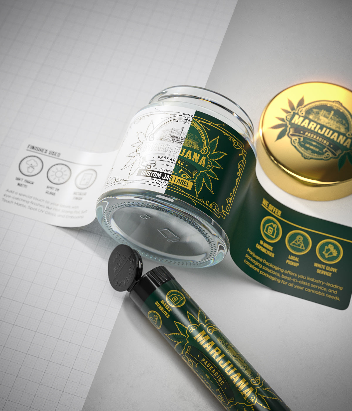
- Surface finish guidelines (matte, gloss, soft-touch)
- Embossing, debossing, or foil stamping standards
- Sustainable material alternatives and their appropriate applications
The physical experience of handling your packaging creates powerful brand associations that complement visual elements.
Measuring Success and Evolving Your Packaging Design
A packaging style guide isn't static, it should evolve with your brand and market conditions. Establish metrics to evaluate packaging effectiveness:
- Brand recognition studies
- Customer feedback on packaging functionality
- Retail partner input on shelf performance
- Social media engagement with packaging content
According to research on packaging and brand recall, distinctive packaging elements can improve brand memory by up to 80% among cannabis consumers who may otherwise struggle to differentiate between similar products.
Regular review processes should be built into your style guide management, with clear protocols for updates and versioning to ensure all stakeholders work from current standards.
By developing and consistently implementing a comprehensive packaging style guide, cannabis brands can build stronger visual equity, improve operational efficiency, and create a more cohesive customer experience across their entire product portfolio.







Leave a comment
All comments are moderated before being published.
This site is protected by hCaptcha and the hCaptcha Privacy Policy and Terms of Service apply.