


Table of Contents
- Understanding the Sunset Gradient: What Makes It Effective
- Color Psychology: How Sunset Hues Influence Consumer Behavior
- Implementing Sunset Gradients in Cannabis Packaging
- Market Analysis: Brands Succeeding with Sunset Gradients
- Combining Sunset Gradients with Other Design Elements
- Future Color Strategies: Beyond the Sunset Trend
The Sunset Gradient Trend: How Color Can Boost Sales in 2025
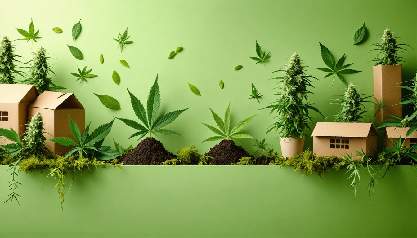
The sunset gradient trend has emerged as one of the most influential design movements in cannabis packaging, characterized by warm orange, pink, purple, and blue hues that transition smoothly into one another. This aesthetic draws inspiration from natural sunset skies, creating an emotional connection with consumers while standing out dramatically on retail shelves.
Understanding the Sunset Gradient: What Makes It Effective
Sunset gradients tap into both nostalgia and natural beauty, creating a visual language that communicates warmth, transformation, and premium quality. Unlike flat colors or harsh contrasts, these gradients offer a sophisticated depth that elevates product perception.
The trend has gained particular traction in cannabis packaging because it balances modern appeal with organic associations. According to recent color trend forecasts, sunset-inspired palettes are expected to dominate shelf space through 2025 and beyond.
Color Psychology: How Sunset Hues Influence Consumer Behavior
Emotional Responses to Warm Colors
The orange and pink tones in sunset gradients trigger specific psychological responses:
- Orange: Conveys energy, enthusiasm, and creativity
- Pink: Evokes feelings of compassion, nurturing, and calm
- Purple: Associated with luxury, creativity, and wisdom
- Blue: Communicates trust, reliability, and tranquility
When these colors transition into each other, they create a more complex emotional experience than single-color packaging. This complexity holds attention longer and creates stronger brand recall.
Implementing Sunset Gradients in Cannabis Packaging
Successful implementation requires understanding both printing capabilities and strategic placement. Many brands are incorporating sunset gradients into their mylar packaging for eighth-ounce flower products, where the visual impact can be maximized across the package surface.
Technical Considerations
When designing with sunset gradients, consider these technical factors:
- Color gamut limitations of printing processes
- Material surface compatibility (matte vs. glossy)
- Gradient direction and focal points
- Text contrast and readability over gradient backgrounds
Digital printing technologies have made gradient reproduction more accessible and cost-effective for smaller brands, democratizing this premium aesthetic.
Market Analysis: Brands Succeeding with Sunset Gradients
Several cannabis brands have successfully leveraged sunset gradients to boost sales and market position. These companies report 15-30% increases in sales after redesigning with sunset-inspired color schemes.
The effectiveness of this trend aligns with findings from research on overlooked design elements, which identifies color transitions as one of the most impactful yet underutilized aspects of packaging design.
Combining Sunset Gradients with Other Design Elements
The sunset gradient trend works particularly well when combined with other contemporary design approaches:
Complementary Design Elements
- Biophilic Design: Nature-inspired aesthetic elements enhance the organic feel of sunset gradients
- Die Cuts: Strategic cutouts can reveal gradient layers for added dimension
- Matte Finishes: Matte surfaces reduce glare and enhance the premium feel of gradient designs
- Hand-Sketched Elements: Artistic illustrations provide contrast against smooth gradient backgrounds
The interplay between these elements creates a multi-sensory experience that extends beyond visual appeal to tactile engagement.
Future Color Strategies: Beyond the Sunset Trend
While sunset gradients show strong staying power through 2025, forward-thinking brands are already exploring evolutions of this trend. Color-shifting elements that respond to temperature or light are emerging as the next frontier, as discussed in this analysis of color-changing packaging.
Strategic implementation of sunset gradients today positions brands to evolve naturally with these future trends while maintaining consistent brand recognition. The key is establishing color as a central brand asset rather than a temporary design choice.
For cannabis brands looking to refresh their visual identity, sunset gradients offer a proven strategy for increasing shelf appeal, emotional connection, and ultimately, sales performance in an increasingly competitive market.


Leave a comment
All comments are moderated before being published.
This site is protected by hCaptcha and the hCaptcha Privacy Policy and Terms of Service apply.